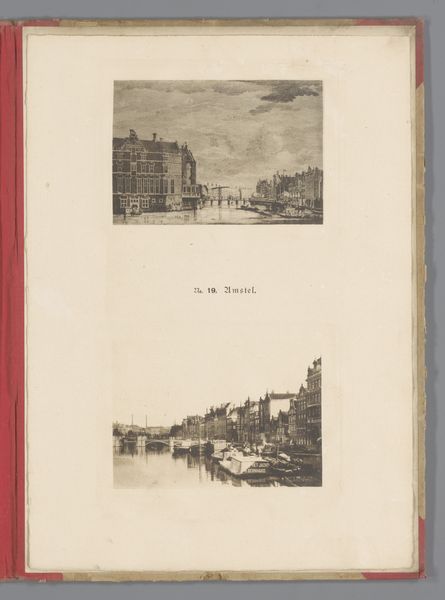
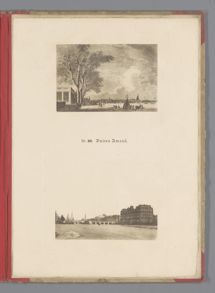
Twee gezichten op 's-Gravelandseveer te Amsterdam, waarvan één reproductie van een prent door Simon Fokke naar Jan de Beijer 1890 - 1900
0:00
0:00
anonymous
Rijksmuseum
drawing, print, paper, ink
#
drawing
# print
#
landscape
#
paper
#
ink
#
cityscape
#
watercolor
Dimensions: height 348 mm, width 250 mm, height 95 mm, width 140 mm, height 104 mm, width 140 mm
Copyright: Rijks Museum: Open Domain
Editor: This page holds two views of 's-Gravelandseveer in Amsterdam, created between 1890 and 1900. One's a reproduction of a print, the other, a drawing perhaps. The images use ink and paper. They seem like studies of perspective, focusing on line and form rather than detail. What jumps out at you about the visual composition of this piece? Curator: The composition immediately draws attention to the spatial relationships. Note the use of line to define edges and create perspective. The drawing's lines suggest depth through foreshortening, converging towards a vanishing point and directing the gaze through layers of built environment. Editor: I notice how both images share a similar scene but present it so differently in texture. Is this just about different artists depicting the same location? Curator: Partially. The distinction is more rooted in artistic technique. The print likely originates from a precise engraving method; each mark contributes to the overall tonal value. Contrast this with the freedom observed in the drawing where line weight conveys the immediacy of observation. This affects the mood considerably. Editor: So, the print emphasizes controlled detail, and the drawing captures spontaneity through a variation of lines. Is the stark contrast intended, or does it simply show the progression of different artists and methods? Curator: That question requires delving into the intention, something difficult without knowing the artist or context, but one can infer purpose. Look at how negative space serves compositional balance; shapes relate proportionally while existing within their allocated frames. Editor: Interesting. I was so focused on subject matter; I missed how strategically the space was used to define the forms. Curator: Precisely. Focusing on such relationships helps discern and classify aesthetic goals independent from historical meaning behind locations portrayed, no? It forces us into asking why such emphasis lies there through specific rendering qualities displayed on each work independently - line variation here especially being notably poignant feature in assessing inherent visual properties intended toward this very objective within two renditions’ juxtapositions alongside others placed beside itself on that one specific leaf. Editor: I see now. I appreciate your formalist approach to thinking about shape, form, lines and relationships!
Comments
No comments
Be the first to comment and join the conversation on the ultimate creative platform.
More like this