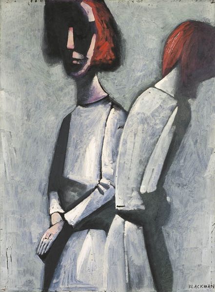
Copyright: Charles Blackman,Fair Use
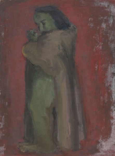
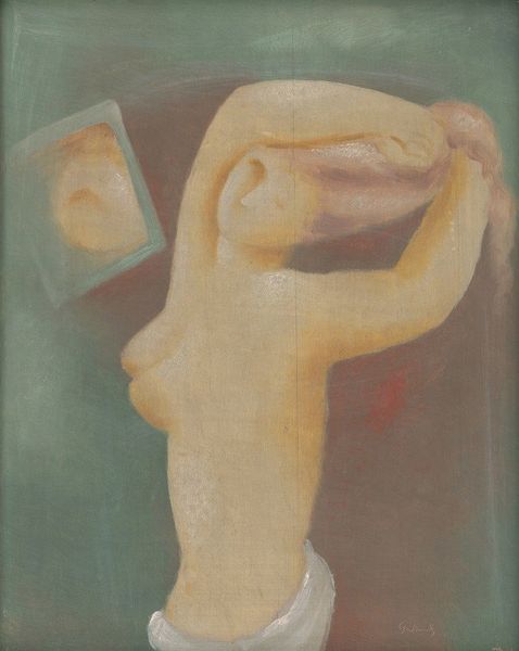
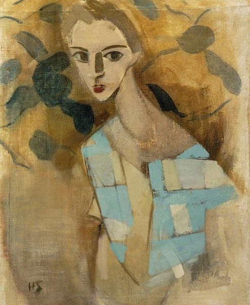
Editor: Here we have Charles Blackman’s oil painting, "An Illusion of Children", created in 1964. I’m struck by how the ghostly figures and muted colors create a real sense of melancholy and detachment. What do you see in this piece, focusing on its form and structure? Curator: I notice first how Blackman uses repetition to suggest a fragmented self. Note the similar shapes of the heads, almost echoing, yet slightly out of sync. This visual disjunction establishes a key tension within the work. Are they reflections or separate entities? Editor: That's a fascinating point about the fragmented self. I hadn't considered how the slight variations contribute to the unsettling mood. The restricted palette – those ochre and muted blues – reinforces this too, right? Curator: Precisely. The restricted palette limits tonal contrasts, resulting in a flattening effect. Space seems ambiguous, the figures almost bleed into the ground, disrupting conventional spatial relationships and directing our attention toward the pure design of the composition. How does that visual compression resonate with you? Editor: I see what you mean about the ambiguity of space. The figures don't seem anchored to any particular place, heightening their sense of isolation. So, it's the formal elements—the repetition, the palette, the flattening of space—that contribute to this overall feeling of unease. Curator: Precisely. We can decode much about its emotional intent by looking closely at the formal components and how they interact to make meaning. The semiotics reveal internal anxieties through pure visual elements. Editor: I appreciate how you’ve unpacked the visual language. Looking at it now, I can really see how Blackman uses form to communicate a powerful emotional narrative. Curator: And hopefully, that's underscored the importance of considering the inherent visual properties, rather than relying on external context alone.
Comments
No comments
Be the first to comment and join the conversation on the ultimate creative platform.
More like this