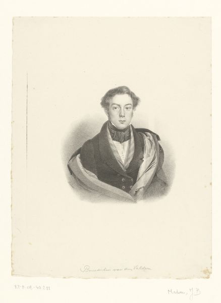
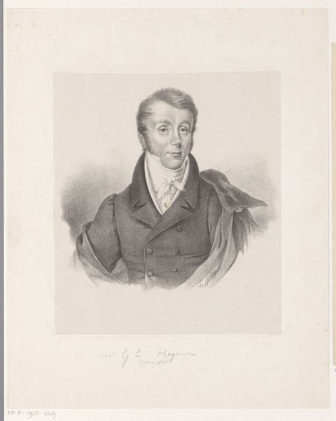
Portret van Hendrik Jozef Franciscus van der Poorten 1822
guillaumephilidorvandenburggraaff
Rijksmuseum
drawing, pencil
portrait
pencil drawn
drawing
pencil drawing
romanticism
pencil
history-painting
realism
Dimensions: height 310 mm, width 240 mm
Copyright: Rijks Museum: Open Domain
Editor: This is "Portret van Hendrik Jozef Franciscus van der Poorten," a pencil drawing made in 1822 by Guillaume Philidor Van den Burggraaff. The softness of the pencil gives it an ethereal quality, almost like he's emerging from a mist. What compositional elements stand out to you in this piece? Curator: The success of this portrait lies significantly in its manipulation of light and shadow, or chiaroscuro. Notice how the artist uses varying pressure on the pencil to create a tonal range that defines the subject’s form. The subtle gradations around the face, for instance, give it volume and a sense of depth, whilst the darker areas suggest the placement of the light source. Editor: That’s fascinating. So you’re saying that without color, the artist relies purely on value to create form? Curator: Precisely. Observe the way the light catches the high points – the forehead, the cheekbones, the ruffled collar – and how that light gradually falls into shadow. This use of value not only models the form but also imbues the portrait with a certain drama. Moreover, the hatching and cross-hatching techniques evident in the rendering of the coat add texture and further depth. The density and directionality of the marks construct a compelling visual rhythm. How does the interplay between these textural variations affect your perception of the subject? Editor: I see what you mean. The rough texture of the coat really contrasts with the smoothness of his face, almost like a contrast between his internal thoughts and the external persona he shows to the world. The artist uses different strokes to portray different sides of the person! Curator: Exactly. It's in the details of these deliberate textural differences that the work obtains such strength, even as the colour pallette remains limited. I am happy to see you are beginning to engage in this painting's artistic composition. Editor: Thank you. I've definitely learned a lot by simply observing the artistic makeup.
Comments
No comments
Be the first to comment and join the conversation on the ultimate creative platform.