print, textile, paper, typography
# print
#
textile
#
paper
#
11_renaissance
#
typography
#
italian-renaissance
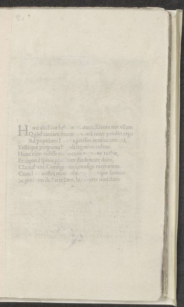
Copyright: Rijks Museum: Open Domain
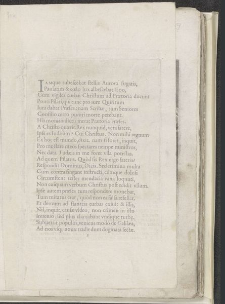
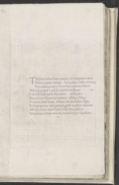
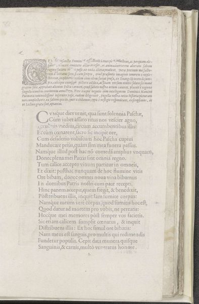
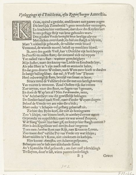
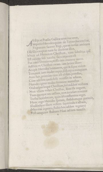
Curator: What strikes you about this particular printed page? It's called "Tekst over Christus aan het kruis" and was created in 1572 by Domenico Mancini. The primary materials here are paper and ink, rendered using typography to convey a textual narrative. Editor: The text immediately feels dense, the page filled completely from edge to edge. This, combined with the age of the paper, creates a kind of visual weight that reflects the gravitas of its themes of crucifixion, of suffering and death. It feels so...contained, almost suffocating. Curator: Indeed. The tight, blocky layout and classical typography lend it a formal air. Semiotically, think about how that rigidity reinforces the authority of the text and the Church in this era. Editor: Absolutely. Beyond the formal elements, I am drawn to what the content reveals about Renaissance-era religious sentiments. Look at the lines addressing Mary; they really reveal contemporary attitudes toward women, maternity, and sacrifice. Curator: Precisely, consider that the Italian Renaissance heavily incorporated Christian themes. Notice Mancini focuses intensely on the moments of Christ’s final words and their emotional significance for his mother. The writing translates accounts in Hebrew, Greek, and Latin in his attempt to be precise in his use of historical texts. Editor: The text becomes more potent when you read between the lines – particularly regarding power structures, divine judgment, and humanity's place in a cosmic hierarchy. Mancini does manage to present us with some subtle interjections and perspective on societal relationships of the time. Curator: A valid observation. Yet, viewed purely from a compositional standpoint, its balance and the considered placement of each letter contributes equally to its overall effect and readability. One could further interpret how Mancini guides his reader to contemplate salvation. Editor: For me, its power isn't located in typography alone, but in the social, historical context of interpreting such charged subject matter in times of upheaval, through various translated voices. Curator: Both valid interpretations, then! Thank you for helping me dissect this powerful, layered printed page. Editor: It has been my honor, until the next artistic encounter.
Comments
No comments
Be the first to comment and join the conversation on the ultimate creative platform.
More like this