About this artwork
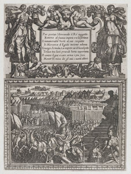
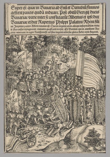
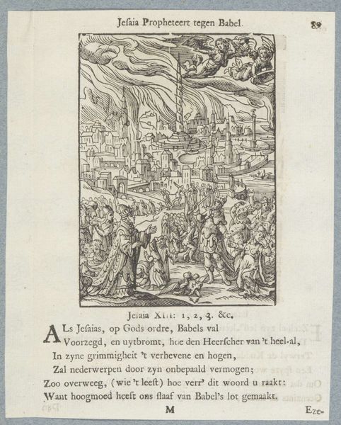
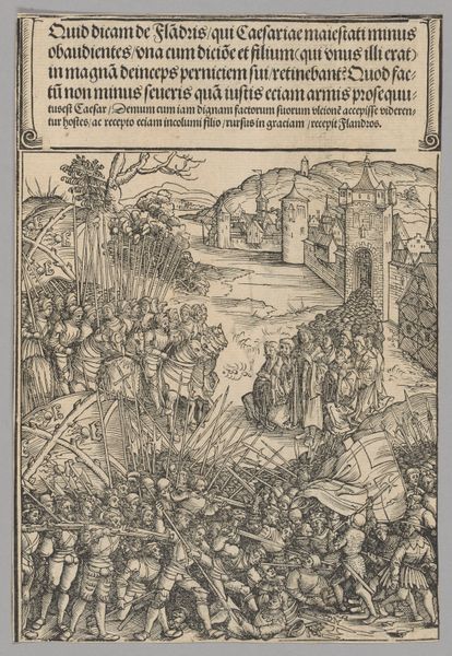
Editor: Here we have "Figures Historiques du Vieux Testament" by Jean Cousin the Younger, made around 1614. It seems to be an engraving, perhaps from a book? The mood is definitely somber, everyone is in obvious distress. What strikes you first about this piece? Curator: Formally, the interplay between the figures and architectural backdrop is intriguing. Note how the linear perspective flattens, compressing the figures into the foreground, almost like a stage. It creates a dynamic tension. Also, consider the varying line weights. They delineate form and shadow but are also independent graphic elements. What effect do you think this has on the viewer? Editor: It almost makes it feel crowded. So much is happening and yet it’s kind of… flat. I’m also wondering why the artist used this specific composition in the top section only. Why add a whole block of text below it? Curator: Indeed. The integration of text as part of the artwork’s structure reflects a very considered decision, no? Semiotically, it directs our gaze. Consider the formal qualities of that decision – the blocky texture of the letterforms creates another contrasting plane alongside the figures and cityscape. It makes a complete, almost self-contained system of visual information. Editor: That’s a good point. So you’re saying it’s not *just* a picture, but it's a designed experience where everything—the figures, the city, the words themselves—works together? Curator: Precisely. It is a confluence of textual and visual elements crafted to produce a unified experience. Ultimately, this composition enhances the visual story with depth. Editor: I never considered all those elements as a purposeful arrangement and unified whole before. Thank you for making me rethink how I analyze the artist's approach!
Figures Historiques du Vieux Testament
1614
Jean Cousin the Younger
1522 - 1594The Metropolitan Museum of Art
Metropolitan Museum of Art, New York, NYArtwork details
- Medium
- drawing, print, engraving
- Dimensions
- Overall: 14 x 10 3/16 x 1 1/8 in. (35.5 x 25.9 x 2.9 cm)
- Location
- Metropolitan Museum of Art, New York, NY
- Copyright
- Public Domain
Tags
Comments
Share your thoughts
About this artwork
Editor: Here we have "Figures Historiques du Vieux Testament" by Jean Cousin the Younger, made around 1614. It seems to be an engraving, perhaps from a book? The mood is definitely somber, everyone is in obvious distress. What strikes you first about this piece? Curator: Formally, the interplay between the figures and architectural backdrop is intriguing. Note how the linear perspective flattens, compressing the figures into the foreground, almost like a stage. It creates a dynamic tension. Also, consider the varying line weights. They delineate form and shadow but are also independent graphic elements. What effect do you think this has on the viewer? Editor: It almost makes it feel crowded. So much is happening and yet it’s kind of… flat. I’m also wondering why the artist used this specific composition in the top section only. Why add a whole block of text below it? Curator: Indeed. The integration of text as part of the artwork’s structure reflects a very considered decision, no? Semiotically, it directs our gaze. Consider the formal qualities of that decision – the blocky texture of the letterforms creates another contrasting plane alongside the figures and cityscape. It makes a complete, almost self-contained system of visual information. Editor: That’s a good point. So you’re saying it’s not *just* a picture, but it's a designed experience where everything—the figures, the city, the words themselves—works together? Curator: Precisely. It is a confluence of textual and visual elements crafted to produce a unified experience. Ultimately, this composition enhances the visual story with depth. Editor: I never considered all those elements as a purposeful arrangement and unified whole before. Thank you for making me rethink how I analyze the artist's approach!
Comments
Share your thoughts