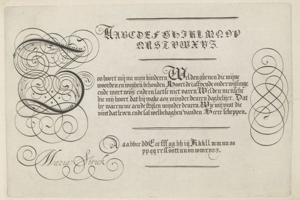
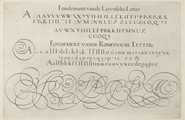
drawing, graphic-art, paper, typography, ink, poster
#
drawing
#
graphic-art
#
art-nouveau
#
hand-lettering
#
ink paper printed
#
hand drawn type
#
hand lettering
#
paper
#
personal sketchbook
#
typography
#
ink
#
hand-drawn typeface
#
sketchbook drawing
#
handwritten font
#
poster
#
sketchbook art
#
small lettering
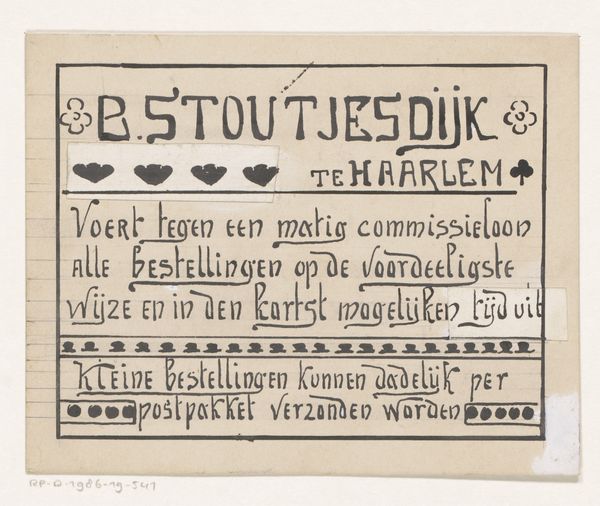
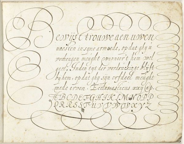
Dimensions: height 107 mm, width 134 mm
Copyright: Rijks Museum: Open Domain
This advertising design for B. Stoutjesdijk was made on paper by Reinier Willem Petrus de Vries. It uses ink to create lettering that draws our attention to the company's services. The design is more than just a means to an end; the lettering is carefully considered. Notice the elongated strokes and angular forms. De Vries engaged with the traditions of calligraphy and graphic design, but with a distinctive flair. The choice of handmade lettering lends an air of authenticity, distinguishing it from mass-produced advertisements. This was a time when the advertising industry was on the rise, driven by increasing consumerism and new modes of production. The design suggests a direct connection between the company and its clientele, hinting at a personal touch in an era of growing industrialization. In considering the design, it is important to consider the labor and skill involved in its creation. By examining the materials, processes, and social context of this artwork, we begin to appreciate the significance of the making.
Comments
No comments
Be the first to comment and join the conversation on the ultimate creative platform.
More like this