drawing, paper, ink
#
drawing
#
aged paper
#
art-nouveau
#
vintage
#
old engraving style
#
hand drawn type
#
paper
#
archive photography
#
personal sketchbook
#
ink
#
old-timey
#
fading type
#
geometric
#
ink colored
#
sketchbook drawing
#
decorative-art
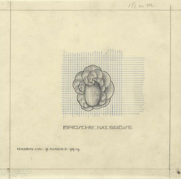
Dimensions: height 191 mm, width 191 mm
Copyright: Rijks Museum: Open Domain
Editor: So here we have "Ontwerp voor een broche," or "Design for a Brooch," possibly from 1914, by Mathieu Lauweriks. It's an ink drawing on paper and… hmm, it has this delicate, almost blueprint-like quality. It feels very precise, but also… nostalgic. What catches your eye most about this piece? Curator: It’s the intersection of geometric precision and organic form that fascinates me. Notice the grid – so rational, so controlled – against the brooch itself, that blossoming, almost floral shape. Does it remind you of anything? Editor: It’s sort of Art Nouveau-ish, with those swirling, naturalistic lines around a central form. But it’s much more restrained. Less… flamboyant. Curator: Exactly! Lauweriks was deeply influenced by mathematical principles. He believed that art should be ordered, even spiritual, accessible through these underlying geometric structures. The grid, you see, isn't just background, it’s the very foundation. Imagine wearing geometry! Is that mad, or marvellous? Editor: So, the beauty comes from the underlying order? It's not just a pretty brooch design? Curator: The beauty *reveals* the order. For Lauweriks, it's about revealing those hidden harmonies. Perhaps in this little jewel we see the cosmos! Well, perhaps that's me getting carried away... or, do you think maybe? Editor: I’m starting to think I need to see the world a little more geometrically. Who knew a brooch design could be so…philosophical? Curator: Precisely! Isn't it wonderful when a small drawing contains a whole world of ideas?
Comments
No comments
Be the first to comment and join the conversation on the ultimate creative platform.
More like this