print, woodblock-print
# print
#
asian-art
#
ukiyo-e
#
woodblock-print
Dimensions: height 190 mm, width 174 mm
Copyright: Rijks Museum: Open Domain
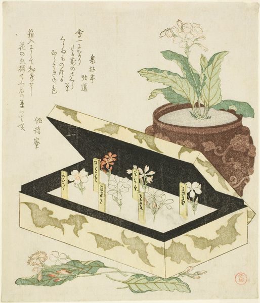
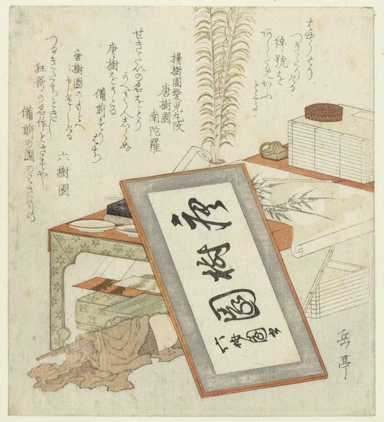
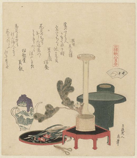
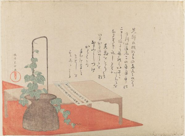
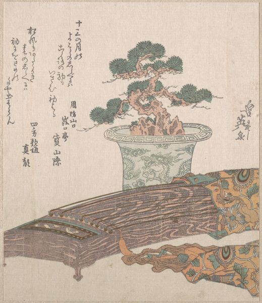
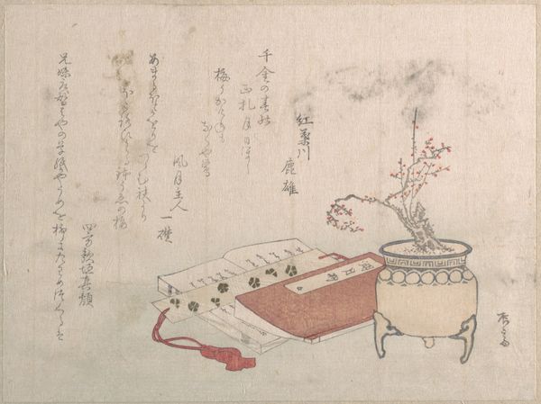
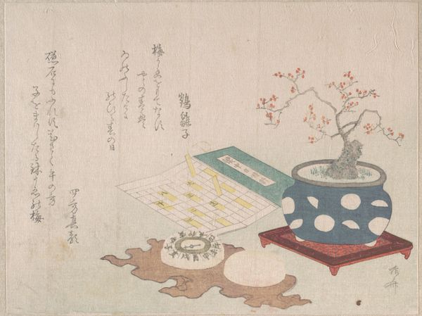
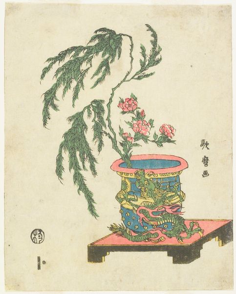
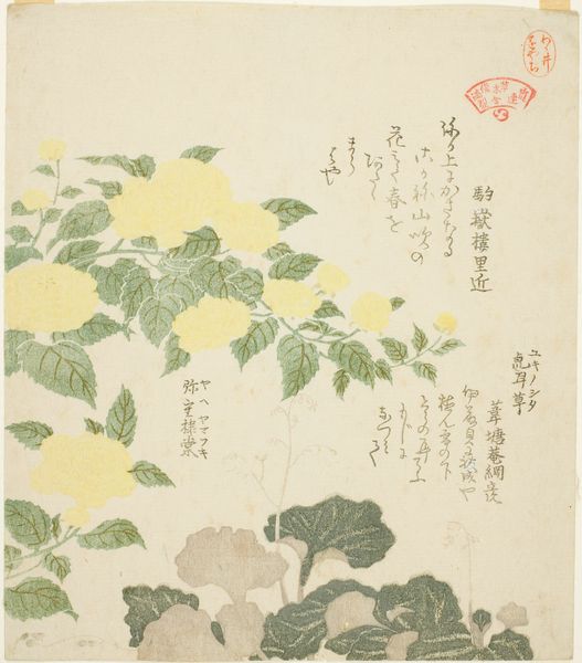
Editor: So, this is "Potted Plant and Almanac," a woodblock print by Totoya Hokkei from 1817. It feels so simple and serene. What initially strikes me is the careful arrangement—the placement of the potted plant relative to the almanac creates a kind of visual balance. What do you see in it? Curator: Indeed. The print demands a reading through its construction, quite apart from any narrative interpretation. Notice how Hokkei's use of line defines space; the curved lines of the pot contrast with the straight edges of the almanac, a structured, rectangular form that seems to anchor the composition. Editor: That contrast is interesting. The curvilinear against the rectilinear—almost like a dialogue. Curator: Precisely. And the color palette – restrained, almost muted – directs our focus toward form and texture. Consider the rendering of the plant; it is stylized, yet there is an attention to the subtle variations in tone that brings the leaves and blossoms into a stark, structural clarity. Do you observe the subtle shading within the pot itself? Editor: Yes, now that you mention it, the light and shadow within the pot's glaze are so understated, yet so critical. How might you account for the artist's choice to depict an almanac? Curator: The presence of the almanac is certainly an interesting decision. What do you think? Is its orientation to the flowering plant purely random, or do you suspect some structural purpose to their relation within the pictorial space? Editor: Perhaps Hokkei's intention in setting the two elements together on a single plane encourages contemplation on time and nature—on permanence and ephemerality? Or is such intention in the eye of the beholder? Curator: A reasonable assertion; and one that, through a thorough Formalist engagement, yields additional perspective to Hokkei’s composition. The visual balance, the interplay of forms and the muted palette—these elements collectively contribute to the work's compelling quality. Editor: I’m starting to appreciate the nuances I didn't see at first glance. Paying closer attention to form and composition, apart from iconography, really unlocks a new understanding.
Comments
No comments
Be the first to comment and join the conversation on the ultimate creative platform.
