Dimensions: support: 527 x 374 mm
Copyright: NaN
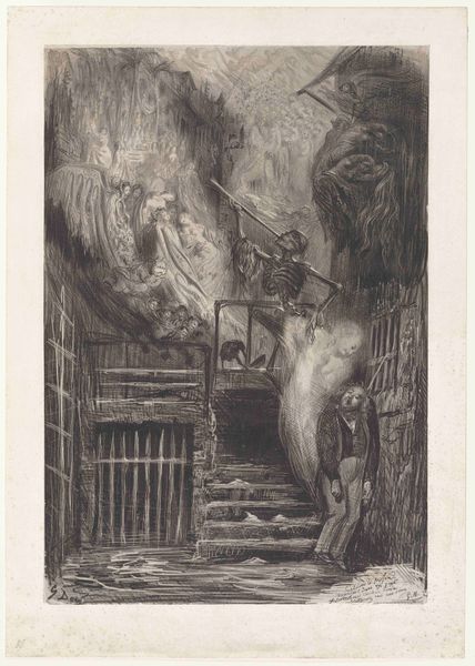
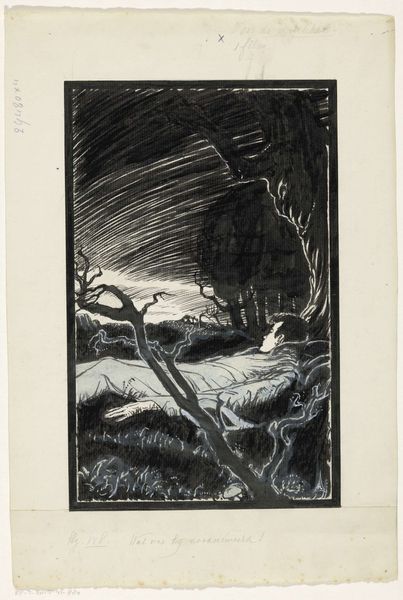
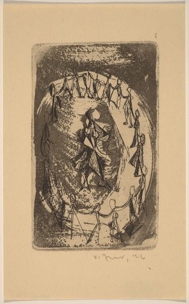
Editor: Here we have William Blake's "The Inscription over the Gate." The Tate dates it to around 1805-1827. It's rendered in watercolor, and something about the color palette just feels chilling. What draws your eye in this piece? Curator: The figures, certainly. Are they beckoning us forward, or warning us away, I wonder? It reminds me of that tightrope walk we all do, between hope and oblivion. Blake's vision is always so deeply personal; he's not just illustrating Dante, he's *feeling* it, isn't he? Editor: Definitely. It's like he's inviting us to contemplate our own journeys, too. Curator: Precisely! Blake’s use of watercolor almost feels like a veil, blurring the line between this world and the next. Editor: I hadn't thought about it that way, but I agree. Thanks for the insight! Curator: My pleasure. It’s always rewarding to share perspectives on such a powerful piece.
Comments
tate 12 months ago
⋮
http://www.tate.org.uk/art/artworks/blake-the-inscription-over-the-gate-n03352
Join the conversation
Join millions of artists and users on Artera today and experience the ultimate creative platform.
tate 12 months ago
⋮
In his Divine Comedy, Dante describes the pilgrimage he made with the poet Virgil, travelling into Hell, up the Mountain of Purgatory to reach Paradise at last. Entering the Gate of Hell was a moment when Dante (in red) wept with fear. Dante describes the ‘dim’ colours which contribute to his terror. Blake’s dark shadows of pure black pigment next to areas of unpainted white paper contribute to this. He used Prussian blue for the blue areas, and indigo blue mixed with yellow for the green foliage, so that they contrast. The blue, green and vermilion red do not overlap. Gallery label, September 2004
More like this