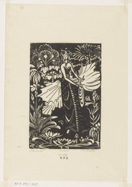
graphic-art, print, linocut, poster
#
graphic-art
#
art-nouveau
# print
#
linocut
#
linocut print
#
poster
Dimensions: height 445 mm, width 210 mm
Copyright: Rijks Museum: Open Domain
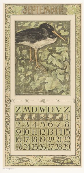
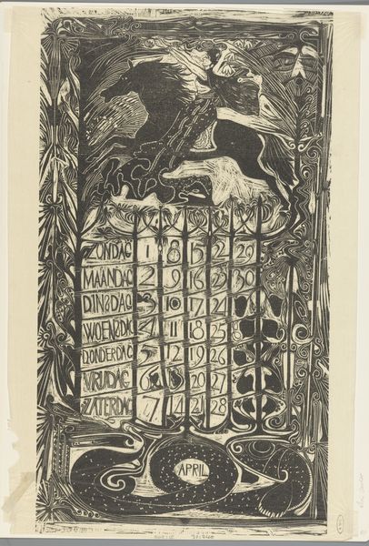
Curator: This is Theo van Hoytema’s "Kalenderblad juli met korenschoven," a calendar sheet for July with sheaves of grain, created in 1901. It’s currently housed here at the Rijksmuseum. Editor: My immediate reaction is the graphic quality. It has an illustrative flatness, almost like something from a children’s book, but with a subdued palette and somewhat unsettling insect life bordering the image. Curator: Indeed. Van Hoytema was deeply involved in the Arts and Crafts movement. What's fascinating is how he embraces the linocut medium. He isn't trying to mimic other techniques; instead, he leans into the bold lines and flat planes inherent in the process. The grain stalks and the calendar grid are testament to that. Editor: Right, it seems incredibly process-driven. I find myself drawn to how the artist integrated natural forms—the dragonflies, beetles, those magnificent longhorn beetles at the bottom—into something functional like a calendar. There's this interesting juxtaposition of nature’s cycle and our human organization of time. Curator: Absolutely. Semiotically, the sheaf represents abundance and the height of summer, while the insects symbolize the vital, sometimes unseen, labor happening in nature. Van Hoytema masterfully integrates the macro and micro perspectives here, doesn't he? The contrast between the broad sweep of the harvested grain and the detailed observation of insect forms creates a beautiful tension. Editor: There’s also something to be said about the mass-production aspect of this. A calendar intended for use would be relatively affordable and distributed widely, engaging with the labor of farming itself and the agricultural year, bringing this stylized depiction of rural life into the homes of people who may be disconnected from those realities. Curator: And I’d add that through that lens of production and distribution, van Hoytema invites a democratization of aesthetics by merging graphic arts and functional design in a visually sophisticated object. The simplification evident in its visual language promotes readability while subtly alluding to the Art Nouveau interest in stylized organic motifs. Editor: Reflecting on it, this seemingly simple calendar is more intricate when we consider not only its formal construction, but the dialogue it establishes between culture and labor. Curator: I agree. Van Hoytema has crafted a sophisticated piece through deliberate form and structure, seamlessly embedding a network of signification.
Comments
No comments
Be the first to comment and join the conversation on the ultimate creative platform.
More like this