print, paper, engraving
# print
#
old engraving style
#
landscape
#
white palette
#
figuration
#
paper
#
line
#
history-painting
#
engraving
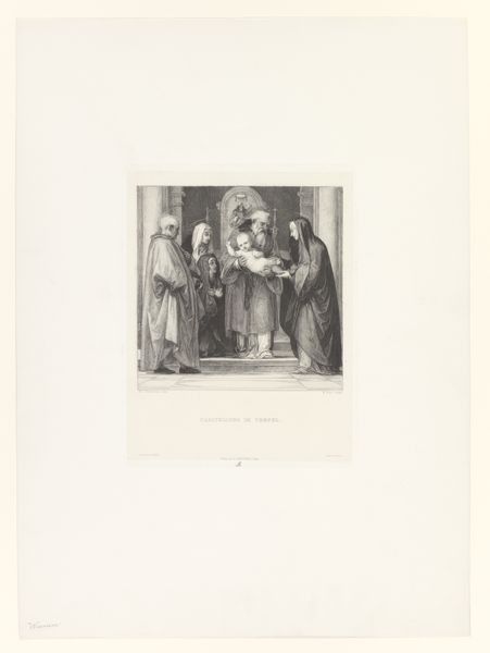
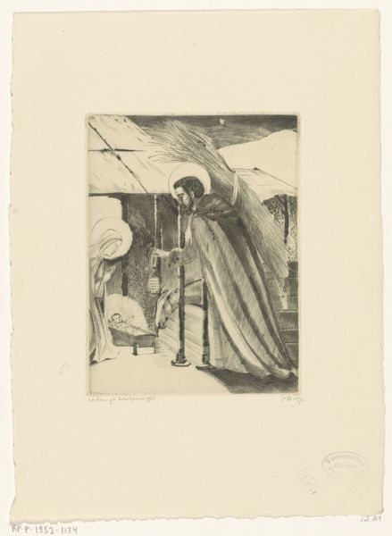
Dimensions: height 158 mm, width 120 mm
Copyright: Rijks Museum: Open Domain
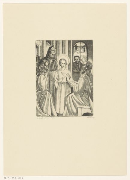
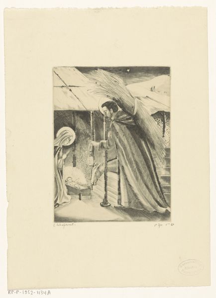
Lodewijk Schelfhout made this small etching of the Presentation in the Temple sometime around the early 20th century. Look at the surface, it’s all line, line, line. The figures are built up through these marks, like a tiny forest of vertical strokes suggesting the folds of fabric. See how the artist uses the etching to create areas of light and dark? The lines are closer together to build tone, and further apart for light. It’s a simple technique, but the effect is quite powerful. I’m drawn to how the architectural elements in the background – the arches, the suggestion of buildings – frame the scene, and set it back in space. It’s a clever compositional trick that really activates the surface and allows your eye to wander. It’s a composition that reminds me a little of early Italian Renaissance painting, but with a distinctly modern twist. Art is a conversation across time, isn't it?
Comments
No comments
Be the first to comment and join the conversation on the ultimate creative platform.
More like this