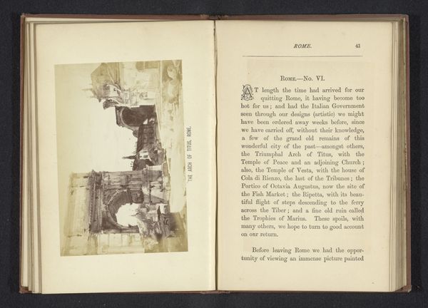
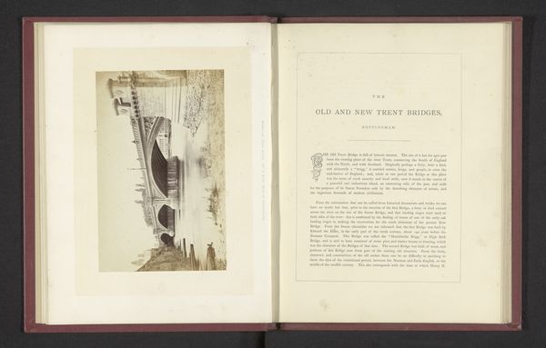
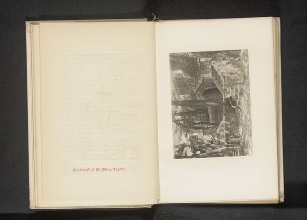
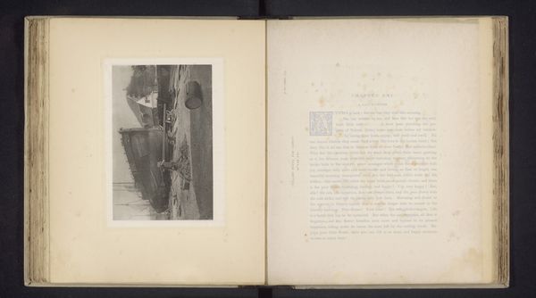
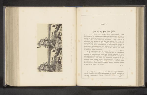
#
aged paper
#
toned paper
#
homemade paper
#
fading type
#
thick font
#
white font
#
handwritten font
#
golden font
#
street
#
watercolor
#
historical font
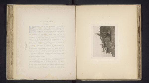
Dimensions: height 105 mm, width 157 mm
Copyright: Rijks Museum: Open Domain
Editor: Here we have "Een kapper in Istanbul knipt iemand op straat" by H. Baudouin, made sometime before 1893. It appears to be a watercolor work. I’m struck by the contrast between the detailed figures and the sketchiness of the surrounding street. What compositional elements stand out to you? Curator: Immediately, I note the division of space within the frame. The street scene occupies a certain plane, distinct from the textual matter to its right. Note the material presence of the book itself. This is a conscious presentation, not just of an image, but of an object. Editor: So, the relationship between the image and the text next to it, and even the book as an object, is crucial? Curator: Precisely. The composition draws our attention to the interplay between image and text, between representation and language. Observe how the aged paper serves as both a backdrop and a testament to the work's history. The artist seems to engage in a dialogue between documentation and artistry, even extending to the deliberate use of varying fonts. How do these textual elements inform your reading of the image itself? Editor: I guess I had only seen the image and the text as separate until now. So the aged look, the style of lettering – all that contributes to its meaning. Is there a symbolic meaning here that maybe ties into why an artist in Istanbul was selected to paint? Curator: Perhaps, but our immediate concern is the internal logic of the artwork itself. Its aesthetic construction. Editor: Right. Thank you; seeing it as a holistic object really changes my perspective. Curator: Indeed. By attending to the formal relations within the piece, we unveil a more profound understanding of its artistic intention.
Comments
No comments
Be the first to comment and join the conversation on the ultimate creative platform.
More like this