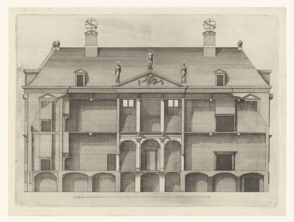
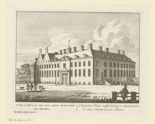
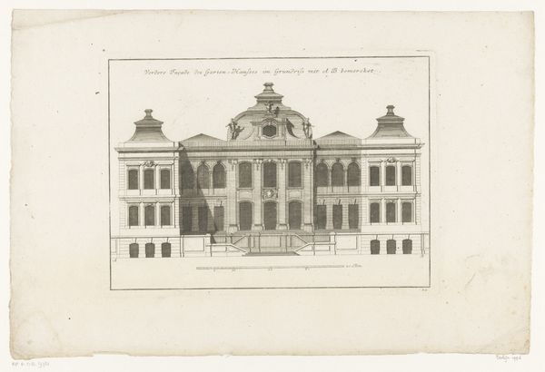
engraving, architecture
#
baroque
#
dutch-golden-age
#
landscape
#
perspective
#
cityscape
#
historical
#
history-painting
#
engraving
#
architecture
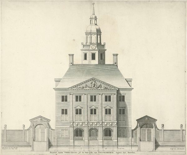
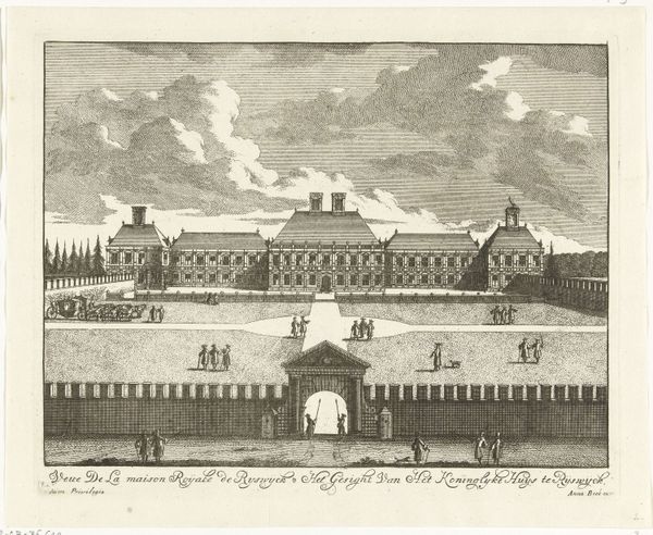
Dimensions: height 294 mm, width 380 mm
Copyright: Rijks Museum: Open Domain
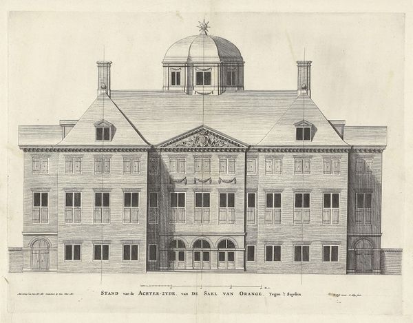
Curator: What strikes you most about this architectural rendering? It's Jan Matthysz.'s "Voorzijde van Paleis Huis ten Bosch" from 1655, an engraving that captures the facade of the Huis ten Bosch Palace. Editor: You know, I find it so…unassuming. Given it’s a royal palace, I expected something more bombastic. There's a kind of quiet confidence, maybe even restraint in the lines and composition. Does that resonate historically? Curator: Absolutely. Consider the period. The Dutch Golden Age was a time of immense mercantile power, and there was definitely a pushback against overt displays of aristocratic flamboyance, unlike in other parts of Europe. This engraving showcases not just the palace, but also Dutch civic values, like restraint. Editor: I see that, particularly in the use of space. It feels meticulously planned, symmetrical, yet there is room, so much air surrounding the solid structure. The building breathes! And the soft lines used by the artist add a lovely sense of depth. The architecture looks less imposing that way, like a grand estate and not just some citadel of power. Curator: Indeed, that balance between grandiosity and livability was key. Palace Huis ten Bosch served as a private retreat as well as a political space, especially for Princess Amalia of Solms-Braunfels, who commissioned the original building. Jan Matthysz.'s work shows the intent of those who commisioned such engravings: promoting a softer image for royal authority. Editor: It feels very pragmatic, I suppose, and less like something intimidating. It is a shame we do not have color because now that I observe more carefully, I feel it could definitely have contributed to a sense of prestige to such important palace! Curator: Exactly. Matthysz.'s engraving makes the most of the monochrome limitations, skillfully suggesting the scale of this important structure and emphasizing the domestic context during an important period in Dutch history. Editor: Thanks, it gave me a different sense of the palace’s intentions, which I find more attractive than the overwhelming type. Now I appreciate its elegant subtlety!
Comments
No comments
Be the first to comment and join the conversation on the ultimate creative platform.
More like this