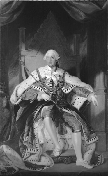
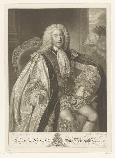
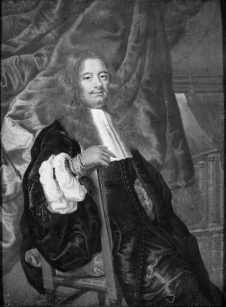
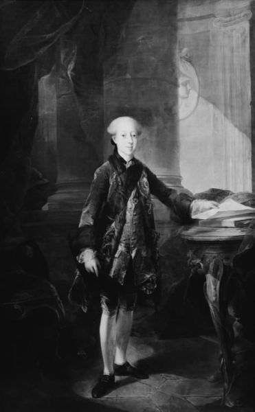
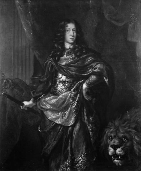
painting, canvas
#
portrait
#
baroque
#
painting
#
canvas
#
black and white
#
history-painting
#
monochrome
#
monochrome
Dimensions: 211 cm (height) x 156 cm (width) (Netto)
Curator: Let's take a moment to examine this portrait, "Frederik IV," painted during his reign from 1699 to 1729 by Nicolai Wichmann. It's currently held here at the SMK, rendered in oil on canvas. My initial reaction? Austerity, despite all the Baroque trappings. The lack of color seems to strip away the... fluff, revealing something stark beneath. Editor: Yes, I see it too. Monochrome can certainly do that. Consider how it changes the way we interpret the ermine, for instance. What typically screams wealth and status is almost drained of its energy here. The black markings seem heavier somehow, burdened rather than buoyant. Curator: Indeed. The ermine is potent, suggesting status, privilege, and divine right. The association with royalty is strong—it speaks of power conferred from a higher source. Here the use of a colorless format is really quite brilliant to my view as a democratizing gesture, a recognition of temporality, which even kings cannot escape. Editor: Structurally, the eye is drawn along diagonals: from the crown at the lower left up through Frederik's body to the elaborate drapery behind him. This interplay creates a tension between his person and his position, all cleverly orchestrated by Wichmann. There is an undeniable presence and intelligence in the King's eyes; note, however, how even-handed the values are, despite the abundance of detail, in the king's sartorial regalia, his eyes never disappear from your perception. Curator: The composition does much to elevate, and yet it also imprisons, doesn’t it? The monochrome also encourages one to delve further into the symbols and discover, beneath the surface of authority and luxury, a kind of humanity that exists for all. His somewhat nonchalant posture—leaning on his staff like an intellectual considering a problem–projects approachability more than power, though you will notice that we don't ever doubt the validity of the sovereign's control of the situation here. Editor: An intriguing observation. The overall tonal consistency gives the work a striking flatness in person, like an ornate tapestry. That deliberate compression enhances both the portrait's presence and the sense of immutable order it projects. A unique piece in how it visually marries that period sensibility and graphic efficiency. Curator: Yes, it truly resonates across the centuries. Editor: A study in power through restriction. Compelling!
Comments
No comments
Be the first to comment and join the conversation on the ultimate creative platform.
More like this