drawing, paper, ink
#
portrait
#
drawing
#
pencil sketch
#
charcoal drawing
#
figuration
#
paper
#
11_renaissance
#
ink
#
pencil drawing
#
portrait drawing
#
history-painting
#
italian-renaissance
#
watercolor
Dimensions: height 145 mm, width 99 mm
Copyright: Rijks Museum: Open Domain
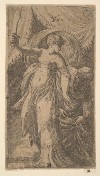
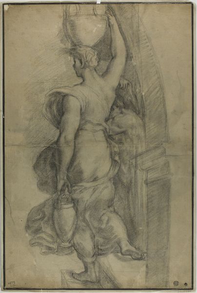
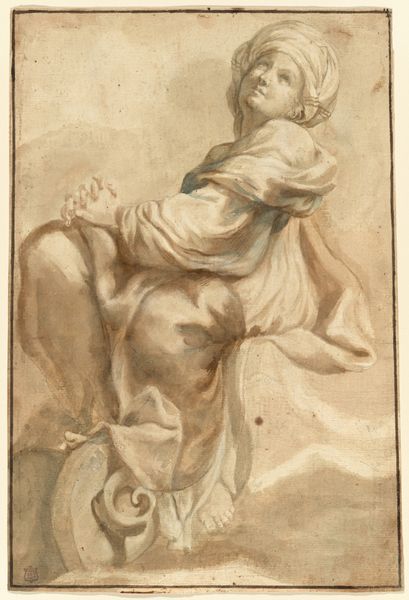
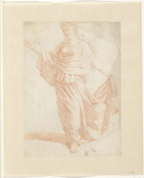
Curator: Ugo da Carpi's drawing, "Voorzichtigheid," made sometime between 1502 and 1532 using ink on paper, invites contemplation, doesn't it? What strikes you first about it? Editor: That the title translates to "Caution," which I find deeply ironic because the pose is far too dramatic and extroverted to be, well, cautious. Look at her; perched like that, gazing so intently into what appears to be a mirror? More vain than vigilant, perhaps? Curator: Ah, but is vanity so far removed from caution? The Renaissance was a time of increasing self-awareness, of individuals positioning themselves within a complex social fabric. Might the mirror suggest the need for careful self-assessment within that framework? The ability to see yourself as others see you was considered essential in navigating the often treacherous waters of courtly life. Editor: That's an interesting point. Placing this work within its Renaissance socio-political frame certainly colors it differently. Still, it’s hard not to feel like there's something else at play. Look at how the light dances across the drapery and creates a really playful tension between the exposed skin and covering folds. Is this really about politics, or more about the sheer visual pleasure of exploring form? Curator: It's both, I suspect. The human body was becoming an increasingly important subject. Also, remember that "Prudence"—which is how the title is also sometimes translated—was a significant virtue during that era. She's not merely admiring herself; she is taking counsel. Her introspection enables measured decisions in matters of state, you know? It speaks to the humanist ideal, that good leaders required strong character. The vessel next to her suggests classical learnings too. Editor: But if we accept that idea, why the heavy-handed shading, that smudgy almost frantic pencilwork? It doesn't strike me as the product of serene, measured deliberation. Instead, it feels urgent. Passionate, even. This piece seems so alive in contrast to the sometimes sanitized, didactic quality you see of that era. Curator: That's Da Carpi's particular magic, wouldn't you say? He infused even the most codified imagery with that touch of tangible, very human dynamism. A glimpse into the psychological depth that the best portraiture strives for, reminding us that these historical figures were also thinking, feeling people. Editor: Agreed. The blurring lines, literally and figuratively, certainly push us to consider more human facets. Well, that's been insightful. I won't ever look at the lady of "Voorzichtigheid" the same again.
Comments
No comments
Be the first to comment and join the conversation on the ultimate creative platform.
More like this