graphic-art, print, typography
#
graphic-art
#
art-nouveau
# print
#
landscape
#
leaf
#
typography
#
geometric
#
decorative-art
Dimensions: height 357 mm, width 284 mm
Copyright: Rijks Museum: Open Domain
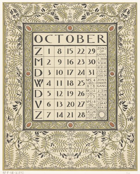
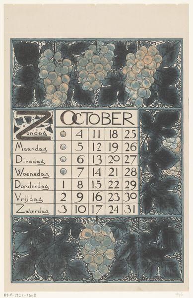
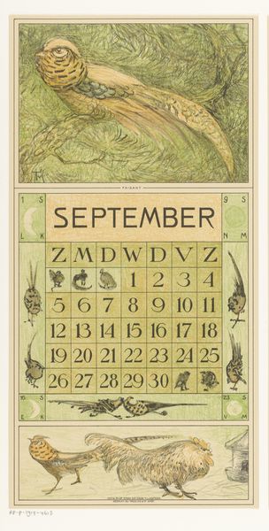
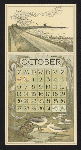
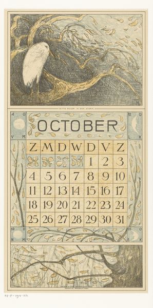
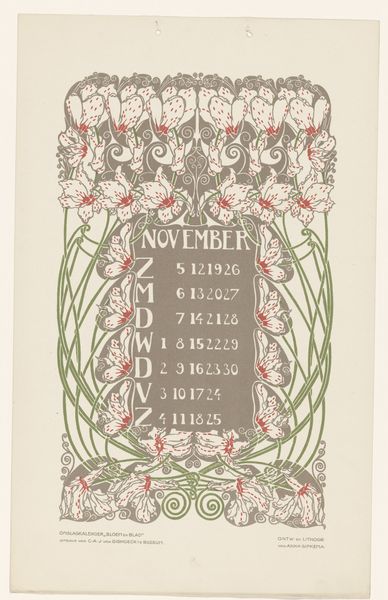
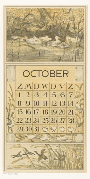
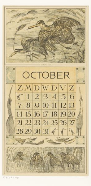
Curator: The Rijksmuseum is home to an array of late 19th-century decorative prints. Here we have Theo Nieuwenhuis's "Kalenderblad voor oktober 1898," created a year earlier in 1897. It’s a beautifully designed calendar page. Editor: It's utterly charming, isn’t it? There’s such a gentle feel, despite the rigid calendar layout. I’m immediately drawn to the soft greens and purples. And, of course, the grapes. Curator: Nieuwenhuis was a key figure in the Dutch Art Nouveau movement. He really mastered the synthesis of typography and image to create striking commercial designs. Think about how visual language evolves alongside consumer culture and how that reflects a rising middle class in this time. Editor: Exactly. The geometric structure is compelling, yet those fluid lines evoke this powerful connection to nature. And you can see the cultural references, too – this image reminds me of the increasing value placed on nature toward the turn of the century, even a return to it. It is very clever for it makes me think of fall with grapes that were recently harvested in Europe. I'm especially captivated by how each day of the week is decorated with an individual leaf or grape detail. Curator: Absolutely. Art Nouveau design embraced both the handcrafted and the mass-produced. It was a time when artists were exploring new ways to make art accessible to a broader public, using techniques and industrial processes to deliver images at a large scale, but one still reflecting particular value systems. Editor: True, it speaks to how the domestic sphere was viewed as a canvas, imbuing everyday objects with beauty and artistry, even a calendar! But look closer at how the rigid grid of the calendar contrasts the whimsical, asymmetrical rendering of the vines. I can see that visual interplay becoming very popular at that time. Curator: Ultimately, this piece provides a fascinating glimpse into the design aesthetics and social values of the period. Editor: Indeed. A beautiful marriage of art and everyday life, reminding us that even functional objects can be imbued with beauty and meaning. It is just great!
Comments
No comments
Be the first to comment and join the conversation on the ultimate creative platform.
More like this