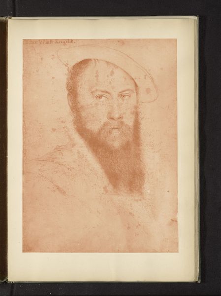
Dimensions: 302 × 204 mm (image); 330 × 229 mm (plate); 459 × 306 mm (sheet)
Copyright: Public Domain
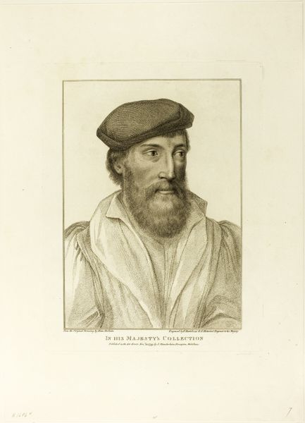
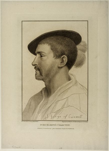
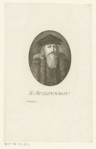
Editor: So, here we have "Reskimer," an engraving from 1793 by Francesco Bartolozzi. It depicts a gentleman in profile, and what really strikes me is the almost excessive detail in the beard compared to the rest of the image. What's your take on this work? Curator: Observe the linearity employed; it is exceptionally consistent. Notice how the hatching defines form through the modulation of line density and direction, a rigorous deployment of graphic convention. Consider, too, how the controlled line quality serves to unify diverse textures: the Reskimer’s beard and hat. Do you find any deliberate contrast between these passages? Editor: I see that the density of lines makes the beard much darker, almost giving it a weight that the rest of the image doesn't have. Is this intentional to draw the eye? Curator: Undoubtedly, but the drawing directs our gaze through compositional means, as well. The turn of the head, the angle of the cap; the convergence point toward the mouth and brow from parallel strokes—all conspire toward a designed, legible experience. It is worthwhile noting that the artist deliberately leaves some negative space around the profile to further accentuate it. Note, also, the lack of strong contrasts in tone. Does this lend itself to a reading of the piece, would you say? Editor: That's true, there's a soft evenness. Maybe that emphasizes the smoothness of the paper. This gives me a lot to consider. Thanks for pointing out the graphic relationships and formal strategies. Curator: It has been my pleasure. Attention to such relationships grants a privileged understanding.
Comments
No comments
Be the first to comment and join the conversation on the ultimate creative platform.
More like this