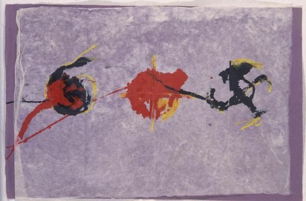
Copyright: Robert Goodnough,Fair Use
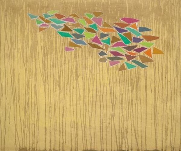
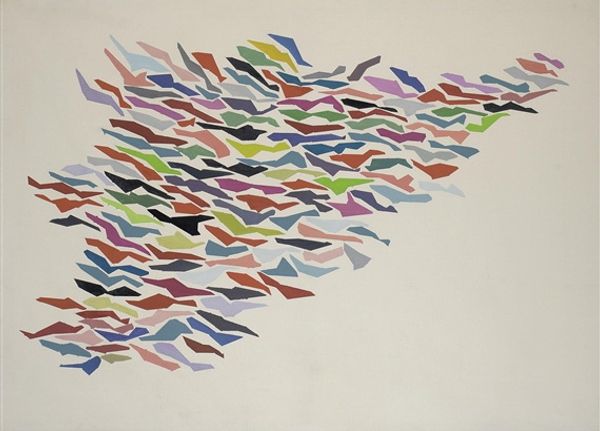
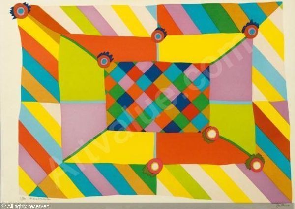
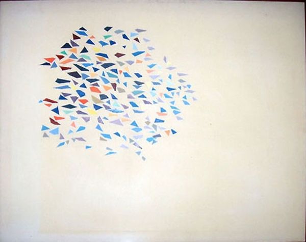
Editor: Here we have Robert Goodnough’s “Colors on Pale Yellow” from 1975, an acrylic on canvas painting. It strikes me as quite playful, with the geometric shapes almost like confetti. What’s your interpretation of this piece? Curator: I find it interesting to consider this painting through a materialist lens. It invites us to reflect on the means of its production: the manufactured canvas, the synthetic acrylic paints, and the tools used to apply them. Think about how Goodnough’s process might challenge traditional notions of artistic skill, as his process involves careful arranging rather than expressive brushstrokes. Editor: So, you’re saying the painting's value is less about the artist's hand and more about the choices he made regarding materials and arrangement? Curator: Precisely! And consider the social context: mid-1970s America, mass production was the norm. Goodnough embraced this through these simplified geometric shapes, creating a space for reflection on how abstraction intersects with broader societal forces and consumer culture. Where do you think the painting succeeds or perhaps falls short, given its materiality? Editor: I guess, initially, I wasn’t even thinking about it that way. It felt light and airy, but now considering the labor and choices behind those materials, it seems like there’s much more than meets the eye. The tension between those ideas feels generative, right? Curator: Exactly! Seeing the artwork this way encourages us to challenge assumptions about art’s creation. I appreciate that we moved beyond a first impression. Editor: Yes, me too! This different approach highlights unseen decisions that ultimately define the piece's aesthetic.
Comments
No comments
Be the first to comment and join the conversation on the ultimate creative platform.
More like this