Copyright: Robert Goodnough,Fair Use
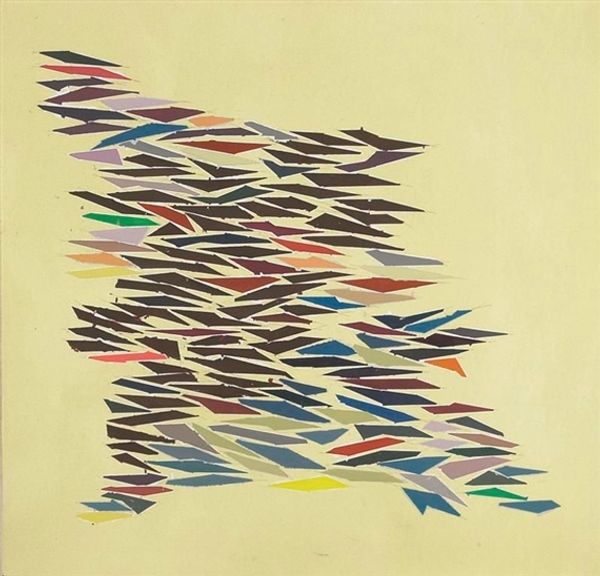
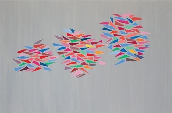
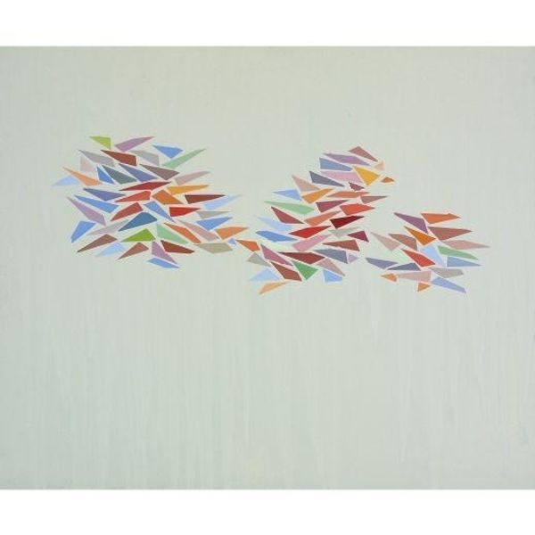
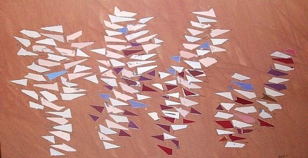
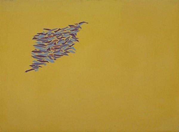
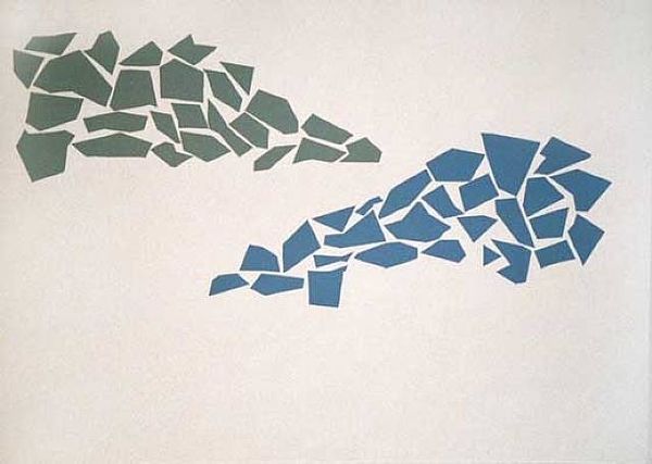
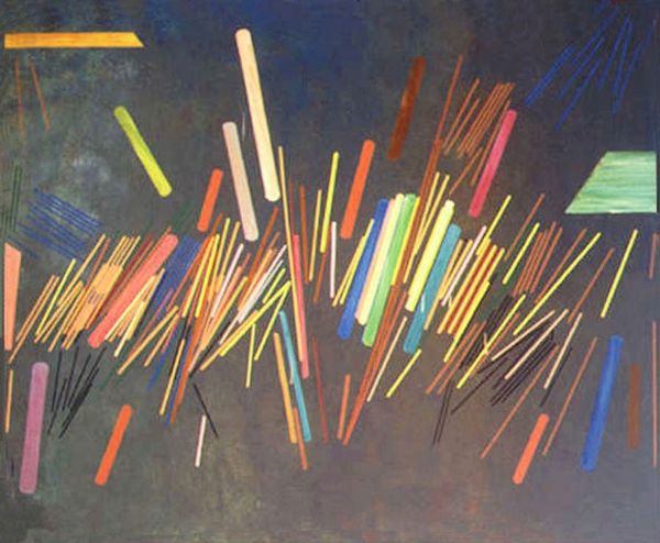
Curator: Standing before us is Robert Goodnough's "Color Shapes," completed in 1975. The artist worked in acrylic paint on canvas to conjure this arrangement of geometric forms. Editor: My initial reaction is lightness, a feeling of gentle ascension. The way the colorful shapes cluster and then disperse against the pale background makes it look like they’re floating upwards. Curator: It's interesting that you perceive a sense of rising. These dispersed, almost fragmented shapes could suggest something deeper, perhaps the breaking apart of established forms, the questioning of traditional structures. These are symbols that permeate so much of postwar consciousness. Editor: Well, seeing that it’s acrylic on canvas raises questions about the perceived divide between 'high' art and everyday materials. The repetitive shapes—how were they made? Are they uniform, mass produced? I'm intrigued by the artistic labor behind what appears to be a spontaneous composition. Curator: Perhaps. But beyond labor, look at how those specific colors interact – the blues, reds, yellows. These aren't arbitrary choices. Color, psychologically, impacts the viewer profoundly. Do the cooler shades soothe or distance? Does the inclusion of warm hues create a sense of unease? Editor: It's also fascinating to consider that something seemingly so free and ethereal still requires a framework – the canvas itself, the material properties of the paint, even the conscious decision of the artist to create these shapes repeatedly. All these choices create structure, or at least imply it, within the apparent freedom of the composition. Curator: And those imposed limits, that controlled application of color, can provide viewers a grounding amidst perceived chaos, or at least offer a narrative we are meant to piece back together. What did this controlled use of pigment symbolize? What narratives did he want us to rebuild or abandon? Editor: It’s like Goodnough used commercial materials but created a language of his own to push and pull ideas that question both the art world of his time but still uses conventions like “abstraction”. I mean it's quite clever! Curator: Indeed. These persistent images, like embedded memories, hint at so much more than simple geometric shapes. Editor: Ultimately, “Color Shapes” highlights how the blending of process and concept truly makes this painting shine.
Comments
No comments
Be the first to comment and join the conversation on the ultimate creative platform.
More like this