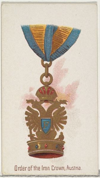
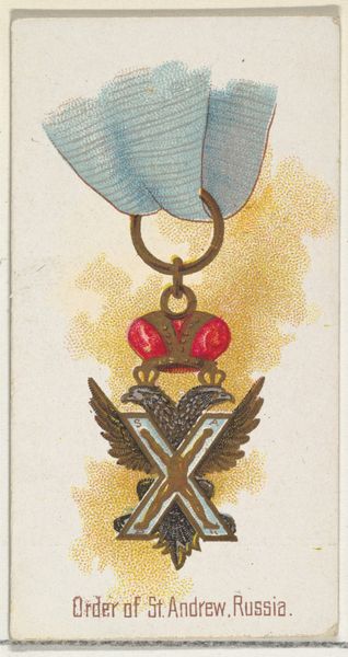
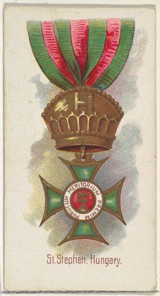
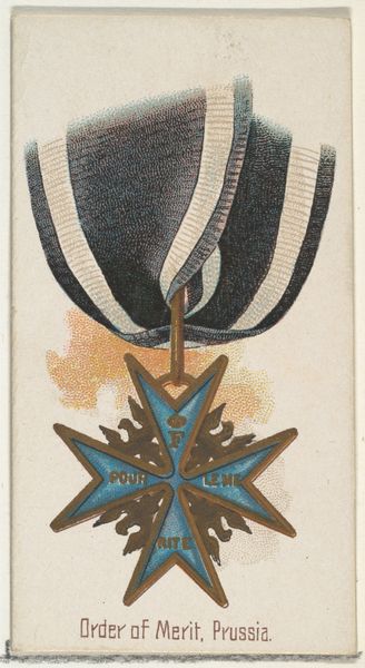
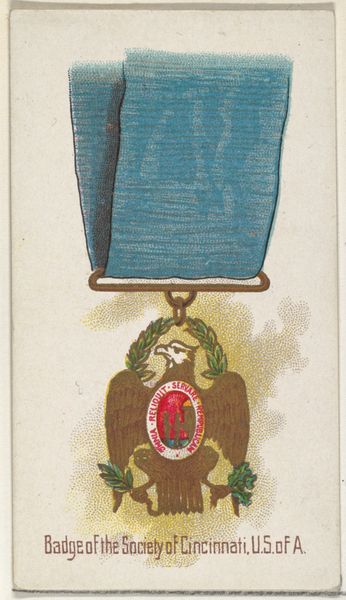
Order of the Crown of Württemberg, Württemberg, from the World's Decorations series (N30) for Allen & Ginter Cigarettes 1890
0:00
0:00
drawing, coloured-pencil, print
#
medal
#
drawing
#
coloured-pencil
# print
#
impressionism
#
caricature
#
coloured pencil
#
watercolour illustration
#
decorative-art
Dimensions: Sheet: 2 3/4 x 1 1/2 in. (7 x 3.8 cm)
Copyright: Public Domain
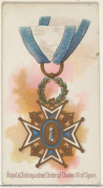
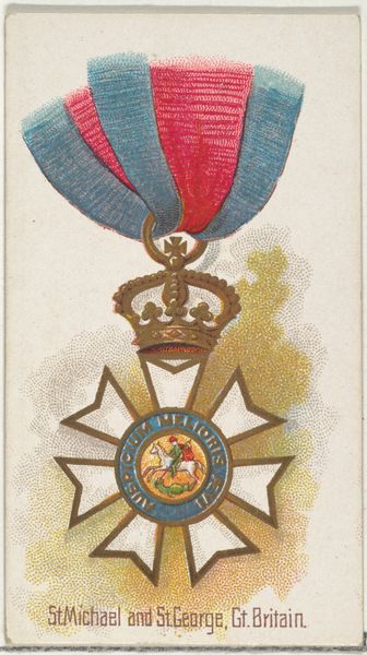
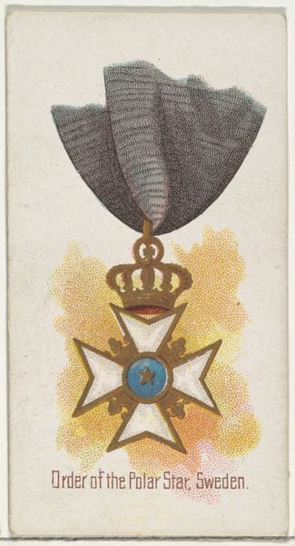
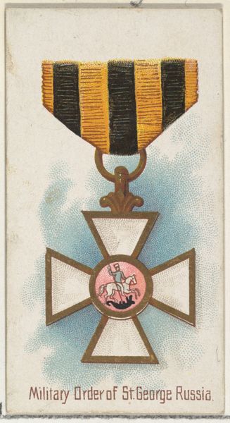
Curator: This object is a piece titled "Order of the Crown of Württemberg, Württemberg," created around 1890 by Allen & Ginter as part of the "World's Decorations" series. It employs both drawing and printmaking techniques, using colored pencils, a true mixed media work! What is your impression? Editor: At first glance, the colour choices strike me. The ribbon at the top almost appears faded. And I'm curious about the seemingly random stippling in the background; it contrasts strongly with the detail of the central elements. Curator: Well, the stippling may reflect its function as a commercial print, these images often filled promotional needs, in this instance, a cigarette card insert. This small format would dictate the intensity of colour. These types of series familiarized the public with the appearance of honors of different countries. Editor: So its purpose dictated its design. The way the cross and crown are stacked vertically creates a symbolic hierarchy, no? Crown above the cross implies something. Does the Order historically reinforce secular authority or acknowledge religious authority? Curator: The Order's design definitely highlights a blending of state power and historical tradition. Note the cross’s central medallion: laurel wreath, likely signifying triumph and honour, but also virtue. I'm more interested in the technical aspects though. The coloured pencil work shows off different intensities of colour throughout, creating depth. Editor: True. Though what appears to me the visual precision of a draughtsman is in actuality an exercise in political visual merchandising. Curator: And the medal at the center creates its own formal language. It communicates allegiance but also adheres to well-established visual semiotics related to form and colour. Editor: Yes. The colour palette seems to invoke the symbolism inherent to heraldry – the blue a reference to loyalty and faith perhaps. These tokens visually consolidated both state and cultural authority. Curator: Considering all of that, one cannot forget its primary purpose as advertising material! A little advertisement meant to convey notions of global reach. Editor: Quite! It prompts reflection on the way values, power and influence circulate within the broader popular culture and, particularly here, within commercial exchange.
Comments
No comments
Be the first to comment and join the conversation on the ultimate creative platform.
More like this