Copyright: CC0 1.0
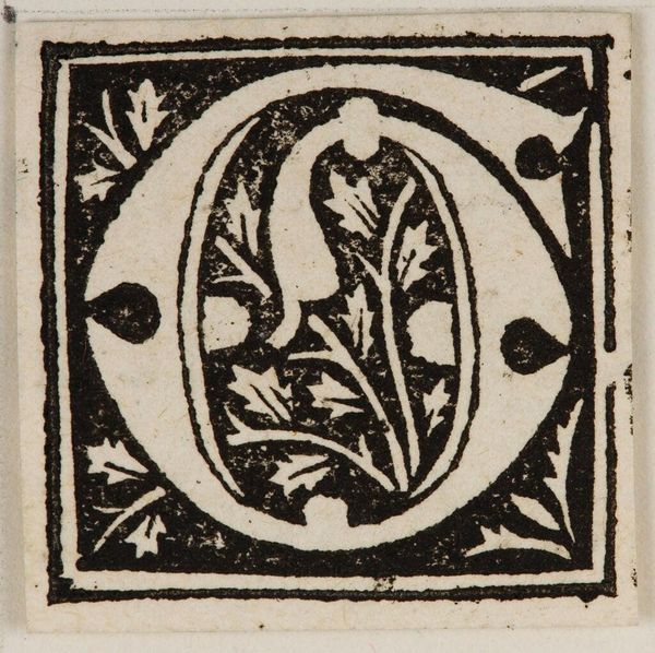
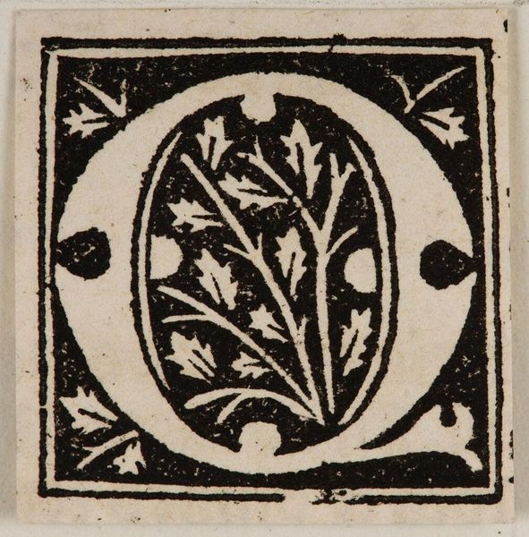
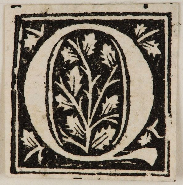
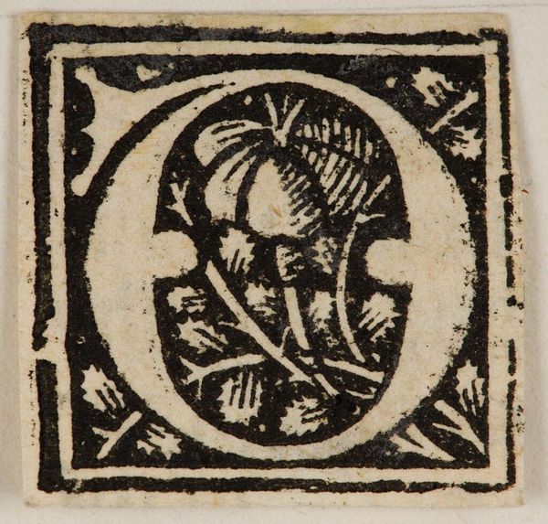
Curator: Here we have "Initial O," an anonymous work held in the Harvard Art Museums. It looks like a woodcut print of the letter "O," filled with stylized foliage. Editor: My first thought is how graphic it is. The high contrast between the black ink and white paper creates a bold, almost assertive visual statement. Curator: Woodcut initials like these were common in early printed books. They served not just a decorative, but a structural role within the text itself. The visual design reflects the power of the church. Editor: I'm struck by the tension between the geometric shape of the "O" and the organic, flowing lines of the foliage inside. Curator: Exactly. The initial letters and decorative patterns could provide visual cues to the reader and denote divisions of text, like chapters. Editor: It's a reminder of how even the smallest details of book design can carry significant artistic weight. Curator: Indeed, thinking about the craftsmanship and cultural role provides such insight. Editor: It's striking how the artist balanced precision and expressive freedom.
Comments
No comments
Be the first to comment and join the conversation on the ultimate creative platform.
More like this