Copyright: CC0 1.0
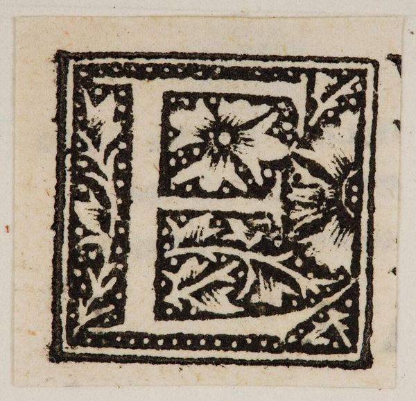
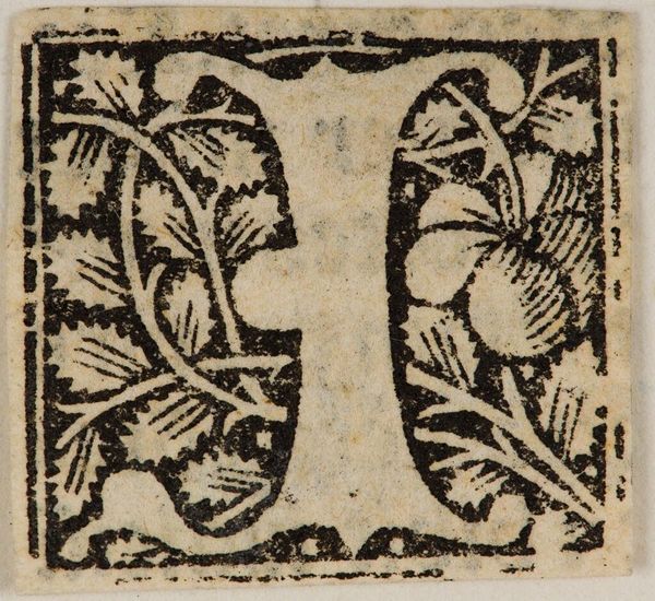
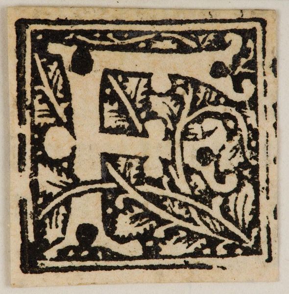
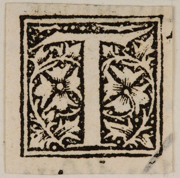
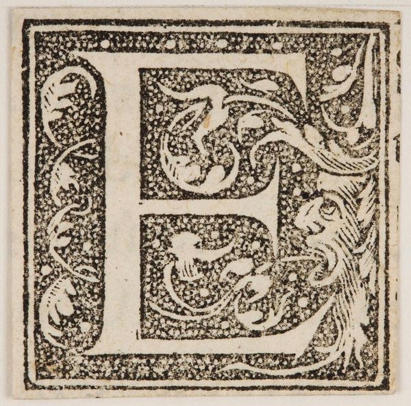
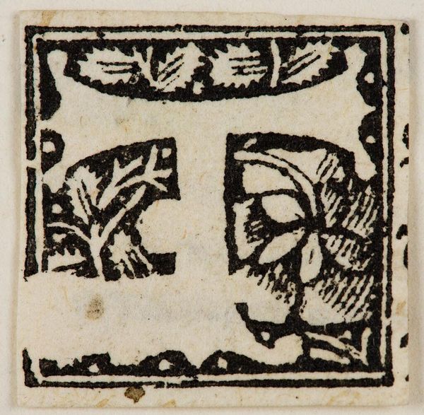
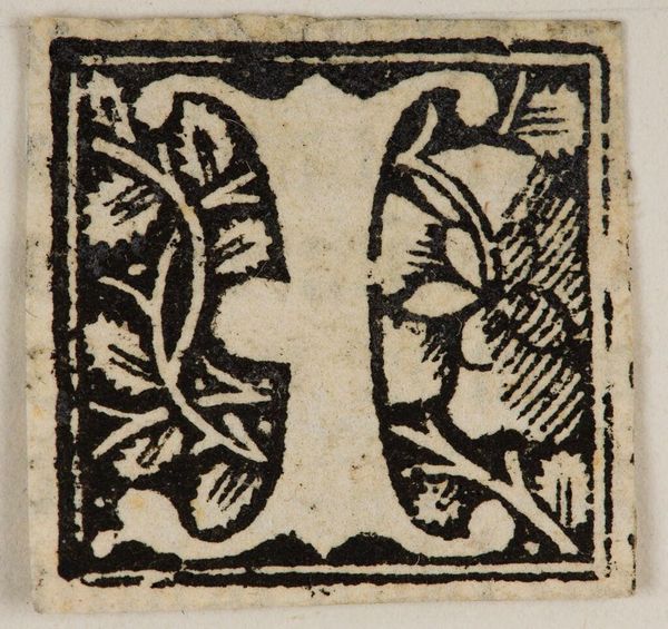
Curator: Here we have the woodblock print, “Letter F,” by an anonymous artist, housed here at the Harvard Art Museums. Editor: It's a compelling study in contrasts. The stark black ink against the white paper creates a dramatic, almost theatrical effect. Curator: Yes, and think about the role of initial letters in illuminated manuscripts or early printed books. This wasn't just decoration; it signaled status, marked the beginning of important texts, and visually reinforced power structures. Editor: The way the floral motifs are integrated within the letterform is masterful. See how they both define the shape and disrupt it, creating visual interest. Curator: Exactly. And the very choice of typography and ornamentation reflected the cultural values and aesthetic preferences of its time. It wasn't just about legibility but about projecting authority. Editor: Looking closely, the artist's hand is evident in the minute details. It is fascinating how these patterns create such a large impact. Curator: Indeed, it offers us a glimpse into the world where letters held such symbolic weight. Editor: And that is the power of abstraction, to convey so much with so little.
Comments
No comments
Be the first to comment and join the conversation on the ultimate creative platform.
More like this