drawing, graphic-art, mixed-media, paper, ink
#
drawing
#
graphic-art
#
mixed-media
#
art-nouveau
#
paper
#
form
#
ink
#
geometric
#
calligraphic
#
line
#
decorative-art
#
watercolor
#
calligraphy
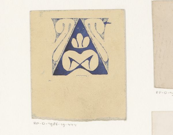
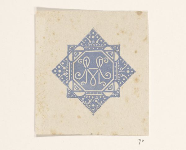
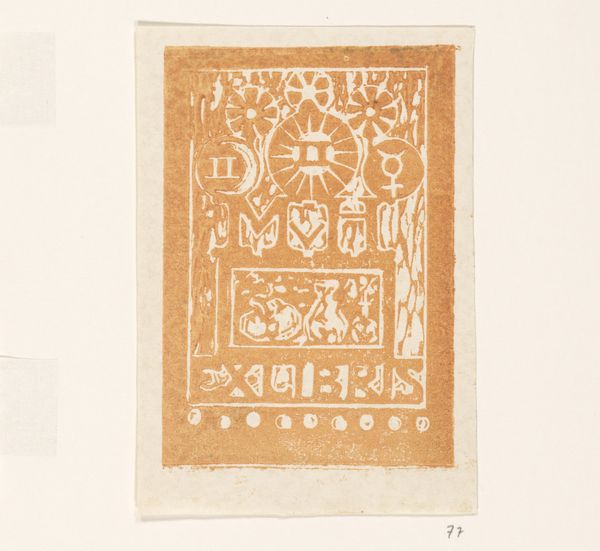
Dimensions: height 88 mm, width 84 mm
Copyright: Rijks Museum: Open Domain
Editor: This is "Monogrammen JHvH" by Reinier Willem Petrus de Vries, probably made sometime between 1884 and 1952. It looks like a mixed-media work on paper, featuring what looks like a calligraphic design. The repetition of forms gives it an interesting, almost architectural feel. What's your take on it? Curator: The layered effect, the repeated "JHvH," reads like a palimpsest of identity, doesn’t it? The Art Nouveau style immediately pulls me towards thinking about societal shifts during that period. There was this rising interest in self-expression through design, challenging academic artistic standards... what were people like De Vries trying to say? Editor: So you see it as a rebellion against the artistic norms? Curator: Perhaps "rebellion" is too strong a word, but it certainly plays into that broader renegotiation of artistic and social values. These monograms become less about mere decoration and more about claiming space, making a statement of self. The "JHvH," whose initials do we think these are? And why repeat them, like incantations? Editor: It definitely makes me think about how identity is constructed and repeated – performative, even. I mean, the careful linework, the choice of colors... they're all deliberate acts of self-representation, right? Curator: Exactly! And it invites us to consider who has historically had the privilege to claim and represent themselves so boldly. Who gets to create these symbols? The subtle floral motifs and geometric forms within a confined space of this image evoke feelings of hope and confinement simultaneously, do you see that too? It also evokes feelings of home or origin as 'H' also stands for 'home'. Editor: I do! I guess I was too focused on the repetition itself, and now I can see how that stylistic choice amplifies his message. Curator: It shows how deeply entwined the personal and political can be, doesn't it? It invites you to contemplate broader issues about identity formation and how cultural narratives shaped personal expressions, then and now. Editor: This was an insightful dialogue; it pushed me to analyze beyond face value, making me delve deeper into identity expression within an artistic framework.
Comments
No comments
Be the first to comment and join the conversation on the ultimate creative platform.
More like this