Copyright: Modern Artists: Artvee
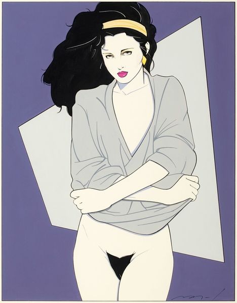
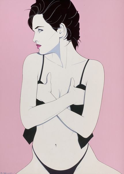
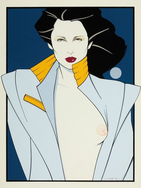
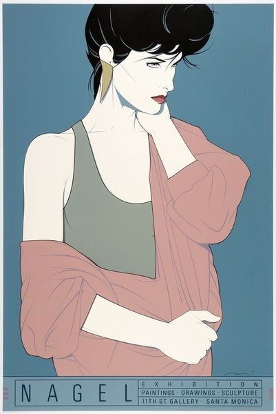
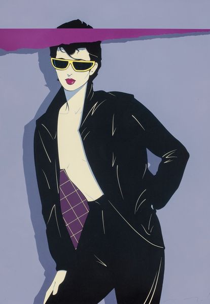
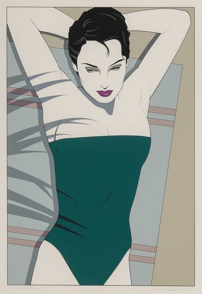
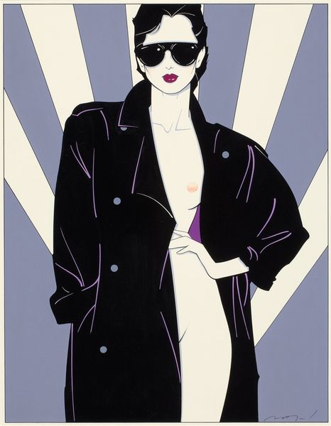
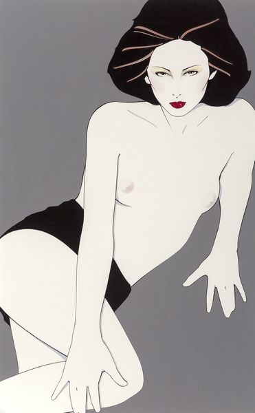
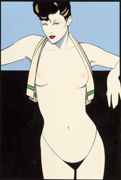
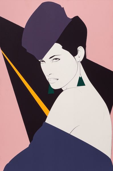
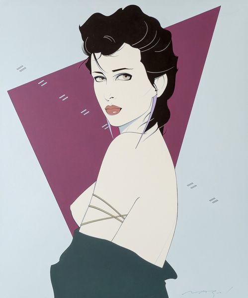
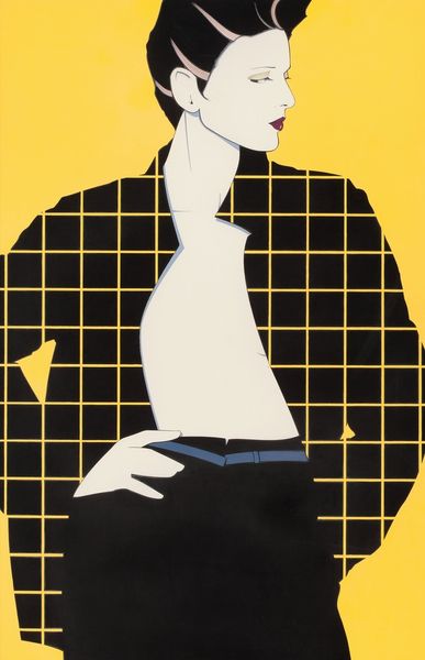
This 'Untitled' image, by Patrick Nagel, is like a snapshot of a moment, but it's also so carefully constructed. You can really see the hand of the artist in the way he's simplified shapes and laid down these blocks of colour. The color palette is all about cool detachment; pale grey, yellow, cobalt blue and flat areas of black. There's something almost airbrushed about the smoothness of the surfaces, but then you notice the sharp edges and contours. It's like he's trying to capture a fleeting feeling of the 80s, but with a timeless sense of design. Check out the line that describes the model's nose and brow, it's like a stylized logo or something. Nagel reminds me a bit of Alex Katz actually, he takes a graphic approach to making paintings with a strong sense of style, that’s still being felt today. Style is always open to new readings though, there are no fixed meanings here.
Comments
No comments
Be the first to comment and join the conversation on the ultimate creative platform.
More like this