Copyright: Modern Artists: Artvee
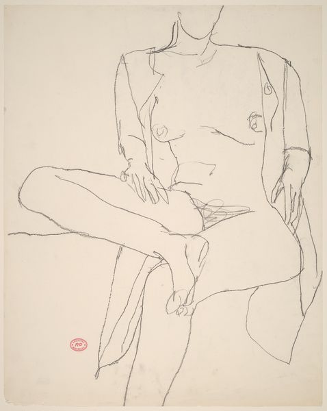
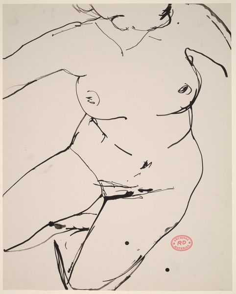
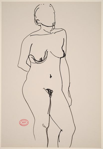
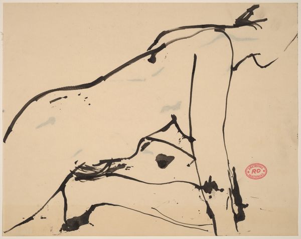
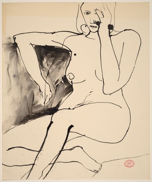
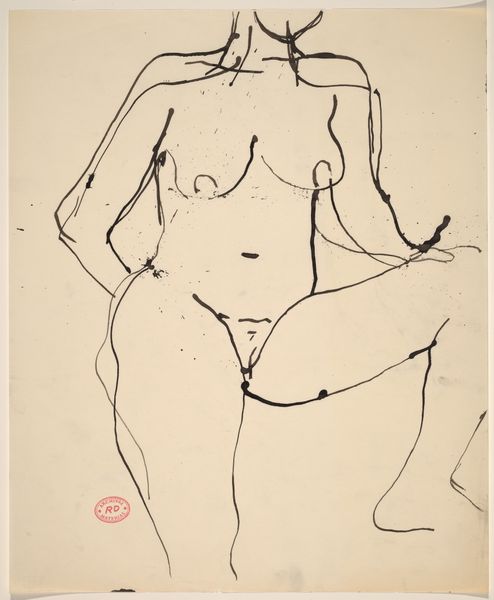
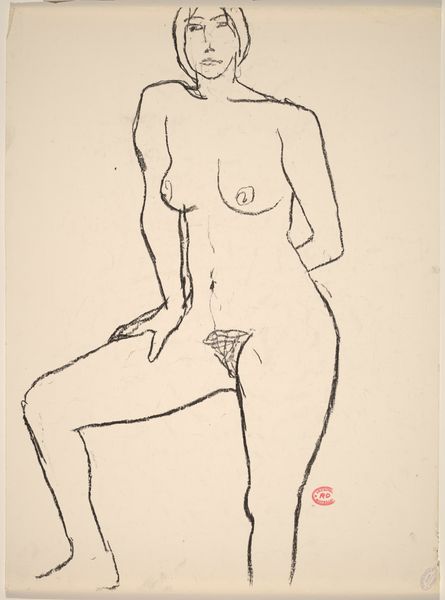
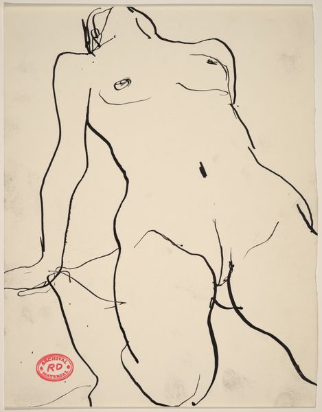
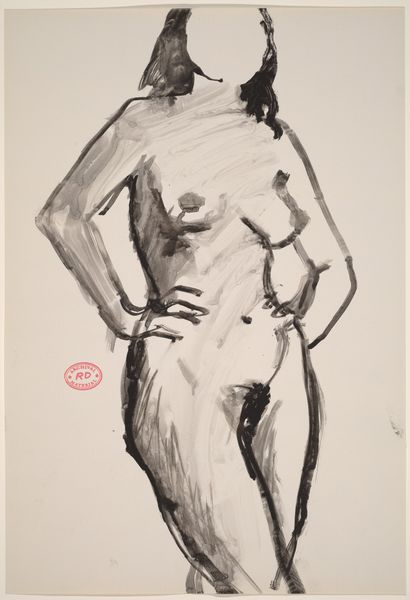
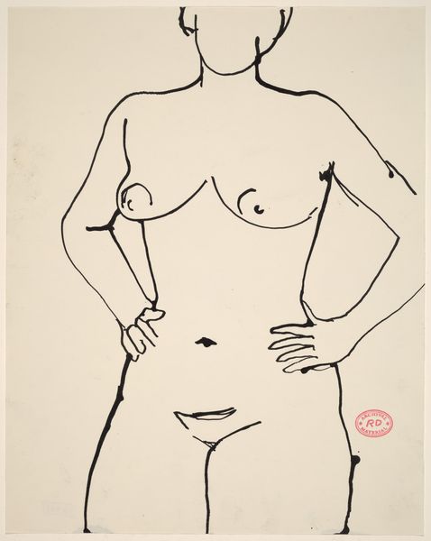
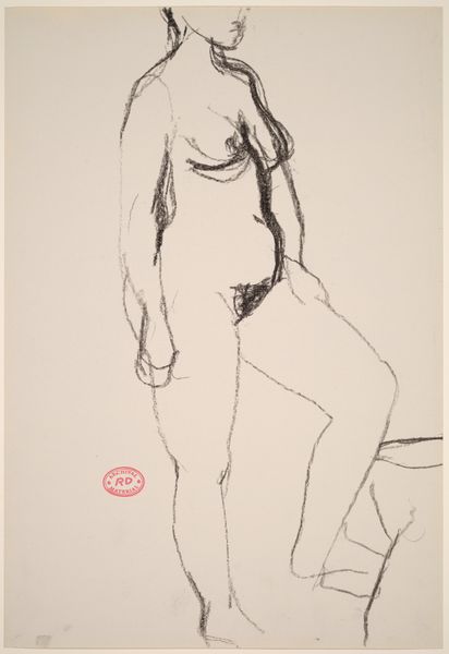
Curator: What strikes me immediately is the artist’s daring simplification. The figure is composed of stark contrasts—planes of solid color meeting at sharp angles. The lack of modulation within those planes almost turns it into a design, a sophisticated, reductive signifier of the female form. Editor: Indeed. We’re looking at Patrick Nagel's "Playboy After Hours illustration," created in 1980, most likely executed in acrylic. It’s interesting to consider the socio-cultural context—this piece comes from a very specific moment where high art and commercial illustration were actively cross-pollinating, each influencing the other in ways that challenged traditional hierarchies of value. Curator: Exactly! Nagel seems particularly fascinated by the graphic impact of shape, contour, and color—in that sense, it almost harks back to Fernand Léger’s tubism, but translated into the hyper-stylized world of 80's commercial design. What is her gaze trying to communicate? I wonder how much the 'male gaze' influences this artist choices? Editor: Undoubtedly. Nagel rose to prominence through Playboy; his artistic path mirrors a shift within the publication towards catering to more urbane sensibilities and moving into a higher class bracket of consumers. His images certainly perpetuated certain archetypes, however it also created aspirational aesthetics tied to both consumer products and what it meant to be a man with “taste.” Curator: The flat planes of color, however, pull in a different direction, moving it towards the Pop Art sensibility; what is the deeper reading there? We almost feel like we should dissect its compositional architecture rather than simply admire what seems to be aesthetic qualities. Editor: These qualities, while attractive and easily digestible by many viewers, need not be unserious, rather his style became part of that specific era’s visual DNA. We cannot extract its popularity from how accessible it felt; a successful commercial artwork speaks clearly to a broad audience and also echoes societal changes back to the public. Nagel managed that difficult negotiation. Curator: That makes me rethink the flat use of acrylic. It's not a limitation; it’s a calculated choice, essential to the image's entire design sensibility, not purely an art that's reflective, but generative. Thank you, it truly brings Nagel's era to light.
Comments
No comments
Be the first to comment and join the conversation on the ultimate creative platform.
