About this artwork
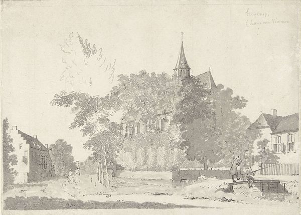
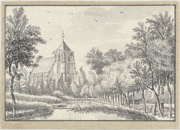
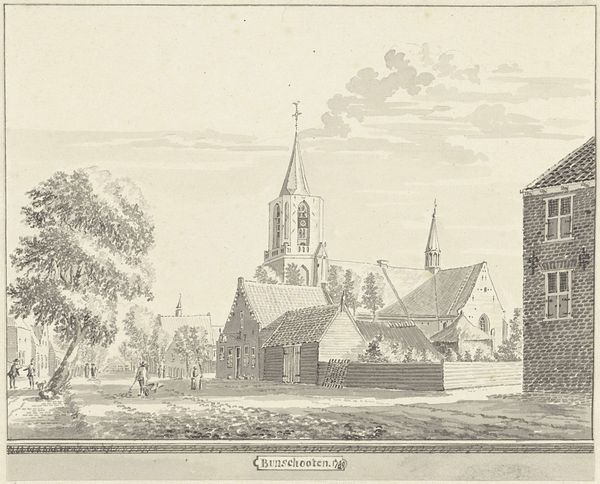
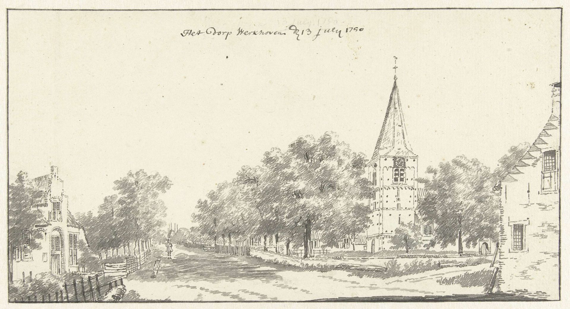
Editor: This is "Gezicht op Werkhoven" by Jan de Beijer, likely from between 1750 and 1757. It's a pen and ink drawing currently held at the Rijksmuseum. I find its delicate lines really captivating, almost dreamlike. What stands out to you in this piece? Curator: Immediately, the artist’s handling of line comes to the fore. Notice the contrasting textures achieved solely through variations in line weight and density. Where are your eyes drawn first, and why do you think the artist chose to emphasize those areas? Editor: My eye goes straight to the church spire – it's the tallest and most detailed element. The artist probably wanted to emphasize its importance to the village. Curator: Precisely. Consider how the verticality of the spire is echoed, albeit in a less pronounced manner, by the trees lining the avenue. The artist creates a rhythmic visual experience by arranging those tall elements in such a manner. And observe the subtle shifts in perspective and spatial relationships—how do these contribute to the overall structure? Editor: It almost feels flattened, not quite photographically accurate. But maybe that enhances the idyllic quality. Curator: Indeed. The simplification of perspective flattens the picture plane, shifting the focus to the interplay of light and shadow suggested by the varied ink washes. Are these strategic tonal variations distributed harmoniously or disruptively, and what effects do these placements suggest to the viewer? Editor: I see what you mean. The darker washes are carefully placed to define form without overwhelming the lighter, airier areas, making it feel very balanced. I hadn't noticed that before. Curator: A key to appreciating De Beijer’s rendering, is thus noting that there is a successful coordination between its contrasting tonal elements. I also appreciate your eye to that the interplay is carefully thought through. A structured interplay which highlights an aesthetic understanding that can be easily enjoyed. Editor: That’s a great way to think about it. I’ll definitely look at drawings differently now.
Artwork details
- Medium
- drawing, ink, pen
- Dimensions
- height 126 mm, width 239 mm
- Location
- Rijksmuseum
- Copyright
- Rijks Museum: Open Domain
Tags
Comments
Share your thoughts
About this artwork
Editor: This is "Gezicht op Werkhoven" by Jan de Beijer, likely from between 1750 and 1757. It's a pen and ink drawing currently held at the Rijksmuseum. I find its delicate lines really captivating, almost dreamlike. What stands out to you in this piece? Curator: Immediately, the artist’s handling of line comes to the fore. Notice the contrasting textures achieved solely through variations in line weight and density. Where are your eyes drawn first, and why do you think the artist chose to emphasize those areas? Editor: My eye goes straight to the church spire – it's the tallest and most detailed element. The artist probably wanted to emphasize its importance to the village. Curator: Precisely. Consider how the verticality of the spire is echoed, albeit in a less pronounced manner, by the trees lining the avenue. The artist creates a rhythmic visual experience by arranging those tall elements in such a manner. And observe the subtle shifts in perspective and spatial relationships—how do these contribute to the overall structure? Editor: It almost feels flattened, not quite photographically accurate. But maybe that enhances the idyllic quality. Curator: Indeed. The simplification of perspective flattens the picture plane, shifting the focus to the interplay of light and shadow suggested by the varied ink washes. Are these strategic tonal variations distributed harmoniously or disruptively, and what effects do these placements suggest to the viewer? Editor: I see what you mean. The darker washes are carefully placed to define form without overwhelming the lighter, airier areas, making it feel very balanced. I hadn't noticed that before. Curator: A key to appreciating De Beijer’s rendering, is thus noting that there is a successful coordination between its contrasting tonal elements. I also appreciate your eye to that the interplay is carefully thought through. A structured interplay which highlights an aesthetic understanding that can be easily enjoyed. Editor: That’s a great way to think about it. I’ll definitely look at drawings differently now.
Comments
Share your thoughts