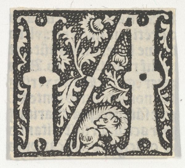
drawing, print, woodcut
drawing
flower
figuration
woodcut
line
decorative-art
Dimensions: Sheet: 2 3/8 × 1 13/16 in. (6 × 4.6 cm)
Copyright: Public Domain
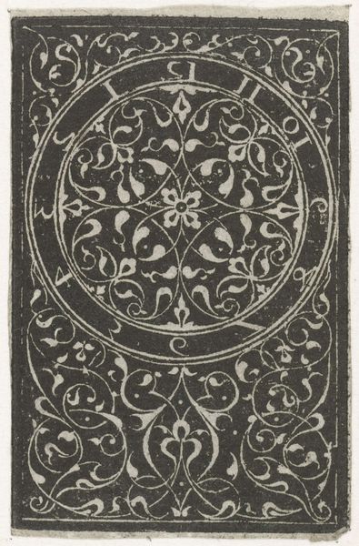
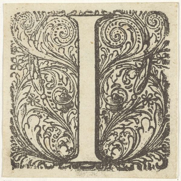
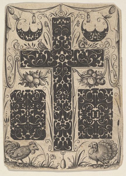
Curator: This woodcut, created around 1496, features an initial letter 'I' adorned with floral motifs. It’s currently held at the Metropolitan Museum of Art. Editor: My first impression is how graphic and decorative it feels. The sharp contrast between black and white creates a visually striking image, doesn't it? It has a real boldness. Curator: Absolutely. The anonymous artist has masterfully employed the woodcut technique. The sharp, clean lines enhance the detailed floral patterns that surround the central letterform. Look how the composition emphasizes symmetry and balance. Editor: These decorative initials would be found in printed books of the period, wouldn’t they? Imagine seeing this crisp black-and-white design punctuating dense pages of gothic script. Did these kinds of images become widespread with the popularization of the printing press? Curator: Indeed, the printing press democratized access to images and literacy in ways never before imagined. These decorative initials marked chapters or sections, elevating the aesthetic experience of reading. They were signifiers of status, of course, because literacy itself had enormous cultural significance. Editor: I’m drawn to the relationship between the rigidity of the 'I' and the organic shapes of the surrounding flowers. The 'I' feels stoic and solid, while the flowers create a sense of movement and vitality. Is it just me or does this seem like a dance between the ordered and the natural world? Curator: You've hit upon a crucial element of its appeal. Semiotically, we might read the straight, upright 'I' as symbolic of order, intellect, or even the divine, given the historical context. While the blossoms, meticulously rendered, reference earthly beauty and fleeting existence. It offers an allegorical tableau of humanity and nature coexisting. Editor: It really makes you think about the social impact of accessible texts back then. It's hard to fathom how this image participated in that. I mean, what does it communicate? Authority? Joy? Both? Curator: A fascinating question that still lingers after all these years. Editor: The dialogue between form and content really enriches our understanding of its historical significance. Curator: Precisely, making it all the more rewarding to explore.
Comments
No comments
Be the first to comment and join the conversation on the ultimate creative platform.