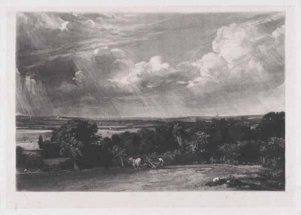
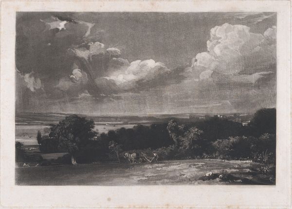
print, mezzotint
# print
#
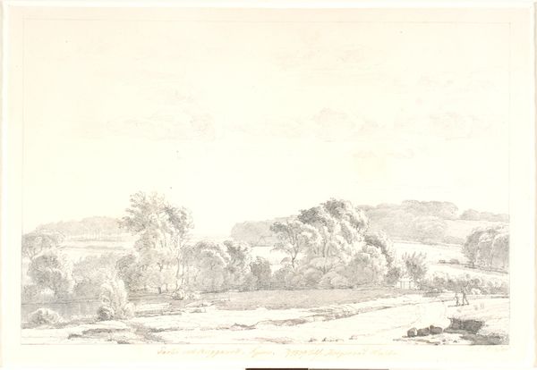
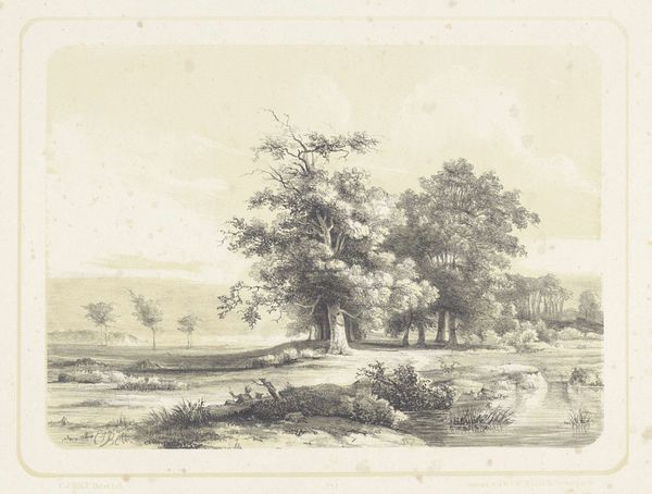
landscape
#
nature
#
romanticism
#
mezzotint
Dimensions: 7 x 10 in. (17.78 x 25.4 cm) (plate)
Copyright: Public Domain
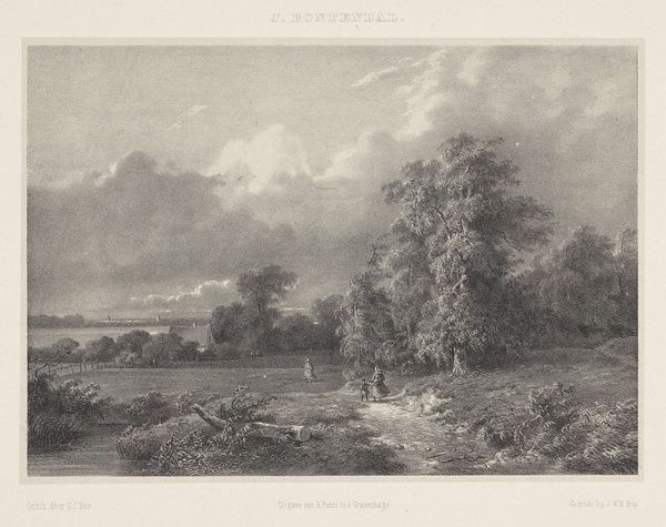
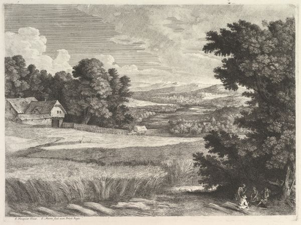
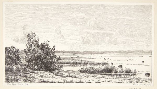
Editor: This is "A Summerland," a mezzotint print made sometime between 1830 and 1855 by John Constable, and housed at the Minneapolis Institute of Art. The contrast between light and dark really draws my eye. What are your initial thoughts on its composition? Curator: Note how the structural arrangement uses the dramatic sky to frame the scene. Constable masterfully divides the picture plane into distinct registers: a brightly lit foreground, a shadowy midground punctuated with texture, and a subdued, almost ethereal background. This is not merely a picturesque vista; it's a carefully orchestrated interplay of tonal values. What do you observe about the application of the mezzotint technique? Editor: I can see that the texture seems soft and blended. It creates subtle gradations of light and shadow. It's very different from the sharp lines you often find in etchings or engravings. Curator: Precisely. Consider the granular surface. The technique allows for this extensive range of tones which sculpts the forms within the landscape. Observe the almost tactile quality in rendering the clouds and foliage. How might we interpret Constable’s choice of this specific printmaking process in relation to his artistic intent? Editor: Well, I suppose he was trying to evoke the atmospheric effects of light and weather more than documenting precise details. The soft textures are great for expressing a romanticized vision. Curator: A valid interpretation. But consider further that his focus might have been an exploration of form itself. By employing mezzotint, he pushes the boundaries of light and shadow, prompting the viewer to delve deeper into the very essence of representation. Note the formal treatment supersedes the literal. What are you left thinking about formal elements? Editor: It strikes me that I’ve learned to focus less on the image, and more on the layers of how the tones interplay together to represent texture. Curator: A close reading always deepens understanding.
Comments
No comments
Be the first to comment and join the conversation on the ultimate creative platform.
More like this