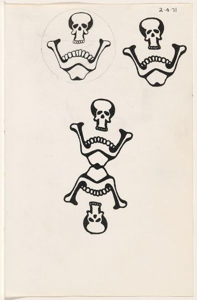
![Untitled ["tattoo" book] by James McCracken Jr.](/_next/image?url=https%3A%2F%2Fd2w8kbdekdi1gv.cloudfront.net%2FeyJidWNrZXQiOiAiYXJ0ZXJhLWltYWdlcy1idWNrZXQiLCAia2V5IjogImFydHdvcmtzLzQ4MTM1ZDExLTI3YmYtNGQyZC05ZWM4LTEyN2ZhMmEwZGY2YS80ODEzNWQxMS0yN2JmLTRkMmQtOWVjOC0xMjdmYTJhMGRmNmFfZnVsbC5qcGciLCAiZWRpdHMiOiB7InJlc2l6ZSI6IHsid2lkdGgiOiAxOTIwLCAiaGVpZ2h0IjogMTkyMCwgImZpdCI6ICJpbnNpZGUifX19&w=1080&q=75)
Dimensions: overall (closed): 17.1 × 13 × 1.5 cm (6 3/4 × 5 1/8 × 9/16 in.) sheet (each approx.): 16.4 × 12.6 cm (6 7/16 × 4 15/16 in.)
Copyright: National Gallery of Art: CC0 1.0
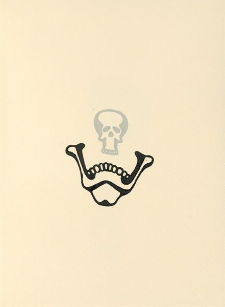
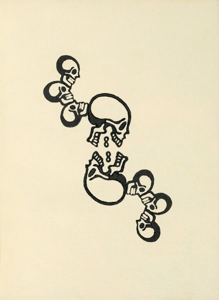
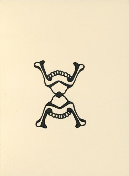
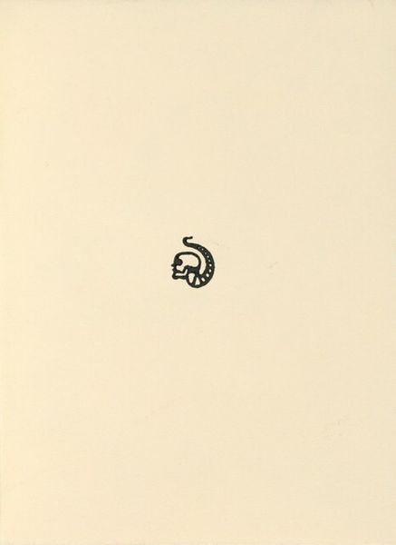
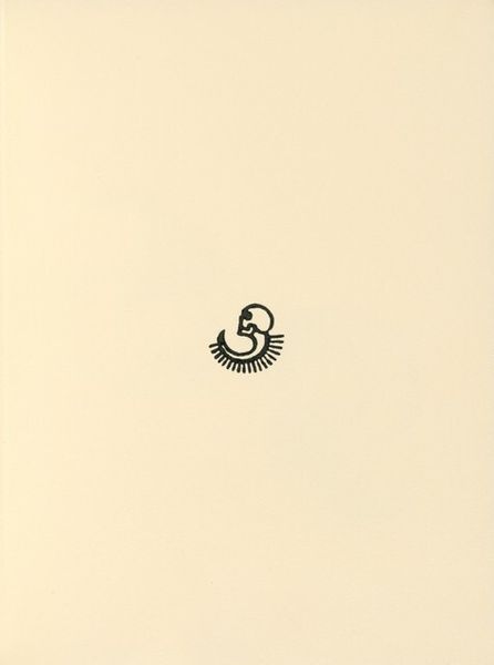
Editor: This is James McCracken Jr.’s “Untitled [“tattoo” book],” from 1971, a graphic art print using ink on paper. It’s got a striking simplicity with its geometric design of skulls in red, circling a black emblem, giving it an almost ceremonial feel. What do you make of its stark composition? Curator: The immediate point of entry, visually, resides in its rigorous employment of symmetry. The red skulls are not merely decorative elements, but formal agents creating balance with the central, more abstract emblem. Do you see how the interplay of the circle containing the emblem and the repeated skulls establishes a visual rhythm? Editor: I do. The consistent use of flat colour, without shading, flattens the space, which is further reinforced by the central emblem, drawing my eye to the shapes. But is there any reason for skulls? Curator: Functionally, the skull repeats as a visual echo of the darker, centrally located form, but it's primarily compositional; however, the symbolic impact is heightened due to its relationship to that very composition. Remove the skulls, or alter their spatial relation, and it wouldn't carry such significant meaning. The symbolism is constructed entirely out of its visual arrangements. Editor: So, you're saying the power lies less in any cultural meaning we might project onto the skulls, and more in their actual design. Curator: Precisely. It highlights the structural integrity of the artwork as a self-contained system. Editor: I see that now. I was focusing on potential external references, missing the importance of its internal logic. Thanks! Curator: A valuable reminder to let form lead your interpretations.
Comments
No comments
Be the first to comment and join the conversation on the ultimate creative platform.
More like this