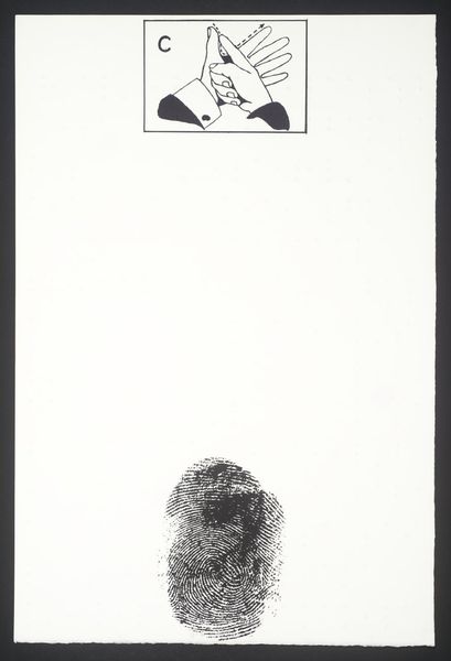
graphic-art, print, typography, poster
#
graphic-art
# print
#
typography
#
geometric
#
poster
#
modernism
Dimensions: page size: 19.9 x 13.9 cm (7 13/16 x 5 1/2 in.)
Copyright: National Gallery of Art: CC0 1.0
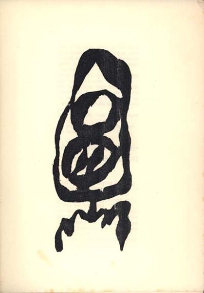
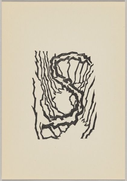
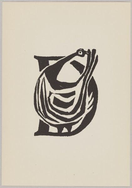
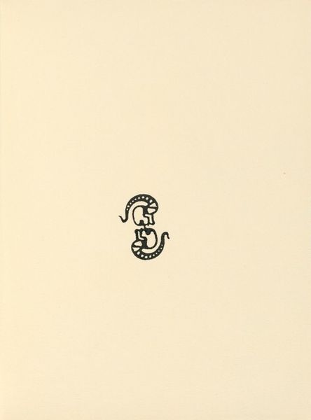
Curator: Looking at this poster from possibly 1953, titled "Grafisch ABC," my eye is immediately drawn to its confident simplicity. What jumps out at you? Editor: The stark contrast between the salmon-pink background and the black graphic. It's deceptively minimal. One can almost feel the weight of the ink, its texture pressed onto the paper. Do we know what printing method they employed? Curator: It's listed as a print within graphic art and typography. This use of typography certainly speaks to a wider context, a desire to instill universal knowledge and structure in a postwar era still reeling from the trauma of fragmentation. Editor: Right. And "structure" is the word. This isn't just playful design; it feels meticulously constructed. Think about the labour involved, each letter a conscious act. Are we ascribing too much seriousness? Curator: No, I don't think so. Look at how the stacked ABC forms a unified, almost totem-like symbol. The letters build upon one another. Each has an intrinsic value and creates a stable composite form. We often subconsciously connect symbols to past memory; seeing them reminds us who we are and from where we came. Editor: It reminds me a bit of Bauhaus, or even De Stijl – a commitment to pure geometric form and functionality. But the poster feels softer, perhaps from the ink. The composition focuses attention. There's very little waste; that carries its meaning through economy. What does this ABC mean within art's broader language system, if we're thinking historically? Curator: It's an opening, a foundation upon which artistic languages are built, broken, and rebuilt. As an alphabet is both finite and offers endless permutations for making different stories and different structures for ordering them, "Grafisch ABC" represents foundational forms for an optimistic world. Editor: Indeed, the tools for building. I see the artist taking very basic materials, ink and paper, but conveying a wealth of ideas in that apparent simplicity. It is powerful, and that final shape carries much weight. Curator: Well, reflecting on it, the power in these stark shapes reveals a yearning for stable symbolic ground, a sort of grounding that contrasts starkly with the period's pervasive anxieties. Editor: Yes, I would also argue its commitment to craft, in a medium often deemed secondary, amplifies this print's silent, forceful message.
Comments
No comments
Be the first to comment and join the conversation on the ultimate creative platform.
More like this