mixed-media, print, ink
#
abstract-expressionism
#
mixed-media
#
pen drawing
# print
#
pen illustration
#
pen sketch
#
text
#
ink line art
#
personal sketchbook
#
ink
#
ink drawing experimentation
#
geometric
#
art-informel
#
sketch
#
pen-ink sketch
#
abstraction
#
line
#
pen work
#
sketchbook drawing
#
sketchbook art
Copyright: Pierre Alechinsky,Fair Use
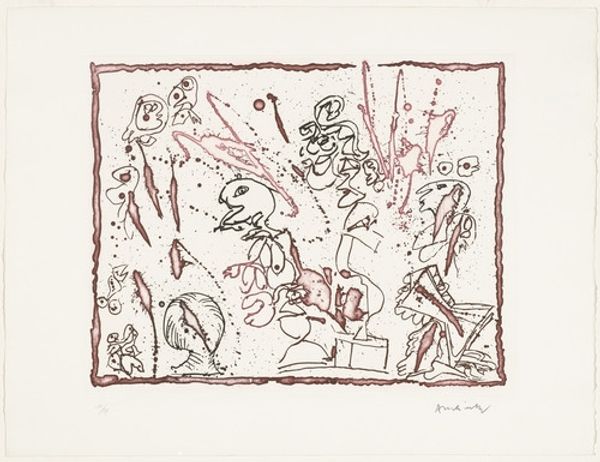
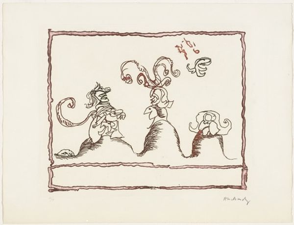
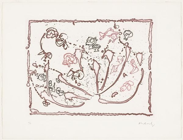
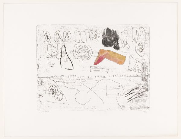
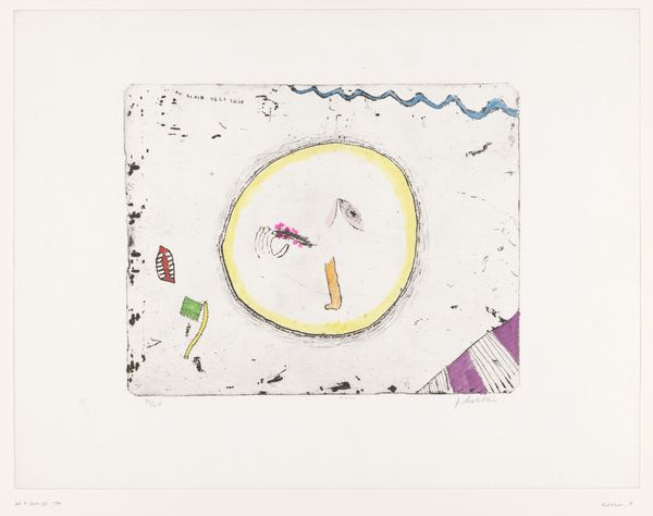
Editor: This is an untitled mixed-media print by Pierre Alechinsky, created in 1966, from the series "The Test of the Title". I find the scribbled, almost chaotic, imagery fascinating. It feels like looking at the behind-the-scenes workings of an artist's mind. What symbols or visual cues strike you when you look at this? Curator: Immediately, I see the visual language operating on several levels. There’s the playful interrogation of the "title" itself rendered in a childlike, almost defiant scrawl. Look closely at how Alechinsky subverts traditional expectations. The geometric shapes juxtapose biomorphic forms, triggering a sense of unease – a psychological landscape perhaps? Editor: I noticed the geometric shapes appearing almost like stages or platforms for the more organic shapes; but where is the center? Curator: Precisely. Notice also how Alechinsky disrupts the expected hierarchy. Traditional iconography places symbolic weight at the center, often vertically oriented, but here, there is visual and psychological weight to all aspects. This, coupled with the automatist, dreamlike quality of the ink work speaks volumes about cultural memory. Editor: So you’re saying the lack of a clear focal point is intentional, part of the statement? How can both "cultural memory" and automatism work at the same time? Curator: It seems paradoxical, but cultural memory is rarely monolithic. It emerges from the subconscious. These images appear free-form, yet carry echoes – distortions – of inherited forms and cultural anxieties from that turbulent decade of the 1960s. Each mark acts as a coded element hinting towards both creation and demolition. Don’t you see it too? Editor: Yes, now that you point it out. I guess I was initially too caught up in trying to make logical sense of the composition. Curator: Precisely. It seems the piece is meant to unsettle and prompt active interpretation, challenging the viewer to complete "the test of the title" themselves. Editor: I like that. It certainly makes me think differently about what a title is, and what art is meant to *do*. Curator: Indeed. It speaks to the power of visual language in shaping – and challenging – our perception of reality.
Comments
No comments
Be the first to comment and join the conversation on the ultimate creative platform.
More like this