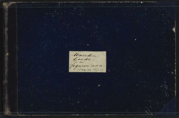
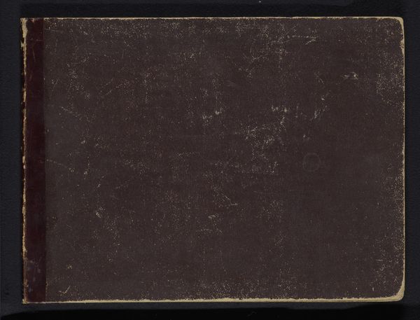
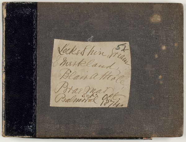
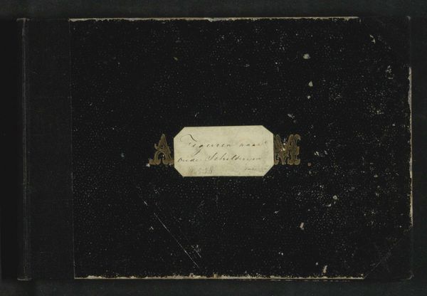
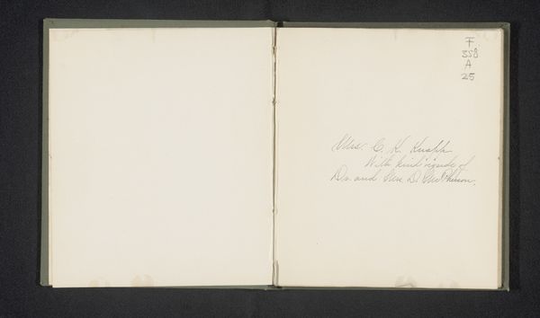
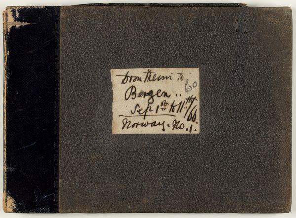
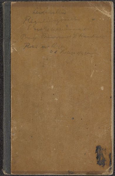
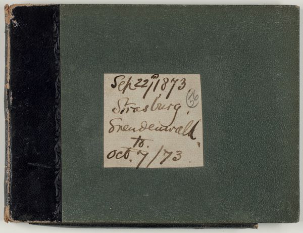
Schetsboek met 39 bladen, deels vervaardigd te Ulm en Leiden c. 1869 - 1871
0:00
0:00
cornelisspringer
Rijksmuseum
drawing, paper, architecture
#
drawing
#
toned paper
#
reduced colour palette
#
impressionism
#
landscape
#
paper
#
personal sketchbook
#
muted smudged
#
fading type
#
ink colored
#
cityscape
#
watercolour bleed
#
watercolour illustration
#
sketchbook art
#
watercolor
#
architecture
Dimensions: height 148 mm, width 226 mm, thickness 14 mm, width 459 mm
Copyright: Rijks Museum: Open Domain
Curator: Here in the Rijksmuseum, we have Cornelis Springer's "Sketchbook with 39 Leaves, partly made in Ulm and Leiden," created around 1869 to 1871. The cover seems simple. What strikes you about it initially? Editor: It looks incredibly tactile; you can almost feel the worn texture of the cover, the grain of the paper beneath that fading label. There's a sense of intimacy. I wonder about its journeys, the hands that held it, and whose stories are captured within those pages. Curator: From a formal perspective, the cover's muted palette is interesting. The interplay between the deep burgundy and the faded label creates a restrained but balanced composition, and we can also discuss its materiality – paper and ink – which evokes a sense of temporal distance. Editor: Absolutely, and think about those cities named on the cover. Ulm and Leiden represent vastly different social and economic landscapes in the 19th century. I'd be curious to understand how Springer's social observations of each city may manifest through the drawings. Is there a contrast in the architectural styles he captures? Are the figure drawings a study of class? Curator: The suggestion that architectural form and societal structure might echo each other is compelling. Do we see a visual semiotics of urban experience being communicated in his arrangements? Let’s examine the sketchbook’s internal structure more closely, turning to the progression from Ulm to Leiden as the basis for a structural reading. Editor: Let’s not ignore that we're viewing these drawings through the very real biases and limitations of the art world today. Are these images predominantly of wealthy, white spaces? Are there marginalized communities absent? Curator: We must of course acknowledge art's positionality, but by looking for those deliberate, self-aware techniques in the artwork – instances of spatial distortion, deliberate contrast in scale between people and buildings – that would tell us more about the artist's self-aware methodology. Editor: Still, thinking about the hands that did the drawing is part of my emotional connection to this simple object. It suggests an effort at art that brings me close to understanding art of that time. Curator: A worthwhile perspective for us to explore. I look forward to considering the sociopolitical implications of Springer's work within these drawings.
Comments
No comments
Be the first to comment and join the conversation on the ultimate creative platform.
More like this