print, paper, typography
#
dutch-golden-age
# print
#
paper
#
typography
#
paper medium
Dimensions: height 261 mm, width 370 mm
Copyright: Rijks Museum: Open Domain
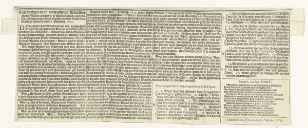
Editor: We’re looking at "Loftekst op de schrijfkunst, pagina 1 van 2," or “In Praise of the Art of Writing, page 1 of 2,” a print from 1608 by Jan van de Velde I, housed at the Rijksmuseum. It’s quite dense; the lettering creates an almost overwhelming textural effect on the page. What are your thoughts when you look at this piece? Curator: The work's visual impact arises from its formal elements—the meticulous arrangement of lines, the interplay of light and shadow within the typography. It transcends the mere conveyance of text. Editor: Can you expand on that? Curator: Consider how the deliberate spacing, the varied weight of the letterforms, create a dynamic rhythm across the page. The rigid structure imposed by the letter blocks contrasts beautifully with the calligraphic flourish of certain characters, lending the work both order and expression. Do you notice how the serifs and varying stroke widths contribute to this dynamic? Editor: I see what you mean; the details are important. So, is the structure of the text just as critical as its literal meaning in this case? Curator: Precisely. Van de Velde I utilizes the structure and material presence of the text to elevate its subject. The essence of writing, or typography in this context, is not just in its semantic content but its formal qualities. It’s a powerful reminder of the art inherent in language and its visual representation. Editor: I hadn’t considered the letters themselves as being a form. Thank you; I see a lot more than just words on paper now.
Comments
No comments
Be the first to comment and join the conversation on the ultimate creative platform.
More like this