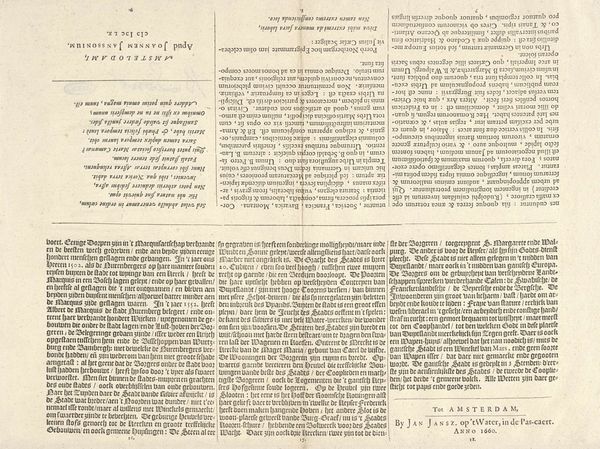
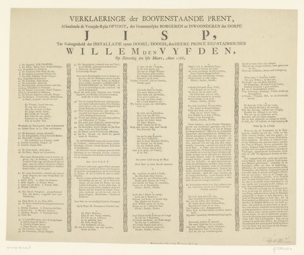
graphic-art, print, engraving
#
script typeface
#
graphic-art
#
hand-lettering
#
ship
# print
#
old engraving style
#
hand drawn type
#
text
#
paragraph style
#
stylized text
#
thick font
#
history-painting
#
handwritten font
#
engraving
#
historical font
#
columned text
Dimensions: height 403 mm, width 292 mm
Copyright: Rijks Museum: Open Domain
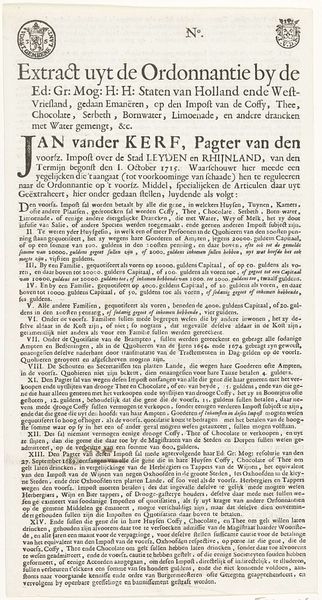
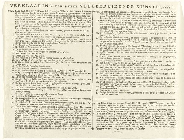
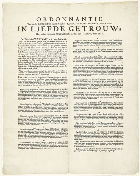
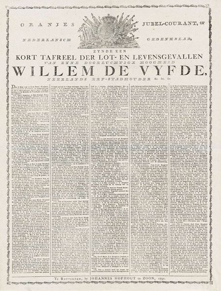
Editor: This print, titled "Spotprent op de opstand van de jonge pretendent, 1746," seems to capture a historical moment with densely packed text and small vignettes. It’s created with engraving and graphic art. The texture looks aged. What’s your interpretation, focusing on its inherent artistic qualities? Curator: Certainly. Immediately striking is the interplay between text and image. Observe how the rigid columned text contrasts with the organic forms of the ship and figures depicted above. Semiotically, the text anchors the image, lending it narrative weight. Editor: So the placement is crucial. Curator: Precisely. The artist arranges distinct visual zones, using contrasting textures and line weights. See how the artist juxtaposes detail and simplification to draw your eyes toward particular components. The typeface itself, with its thick and stylized characters, contributes to the overall density, requiring careful decoding. Editor: Are you referring to the “WAARE EN AANMERKELYKE” text? Curator: Indeed. Notice the relationship with other shapes; text acts as another element of visual arrangement and contrast with shapes. We could even engage structuralism: how do binaries such as "text/image", or "detailed/abstract" play out within this two-dimensional structure? It presents visual riddles requiring engagement. Editor: It’s a new way for me to look at art by strictly studying structure. Curator: Hopefully, it will allow you to move past first impressions, allowing engagement based on close looking and rigorous methodologies. What do you think of the use of typography and fonts in the picture? Editor: I thought this was a printed political pamphlet, but it’s artistic composition creates powerful new perspective.
Comments
No comments
Be the first to comment and join the conversation on the ultimate creative platform.
More like this