Copyright: David Batchelor,Fair Use
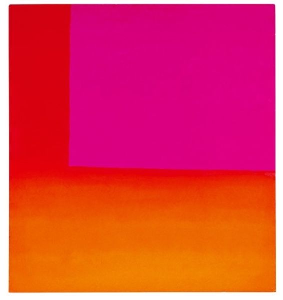
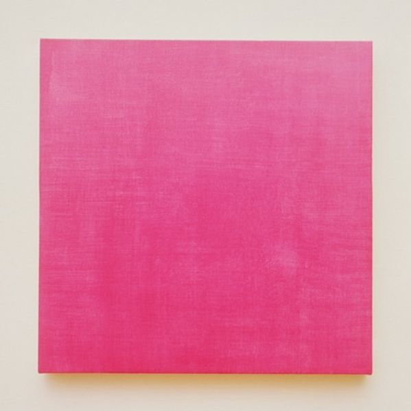
Editor: Here we have David Batchelor's "Electric Colour Picture" from 2002, crafted with acrylic paint and ink. The intense, almost aggressively vibrant pink dominates, it's impossible to ignore! I am so curious – what feelings or ideas does it conjure up for you? Curator: It's interesting that you use the word 'aggressive.' I see a kind of synthetic optimism there, a visual sugar rush. For me, Batchelor’s work always grapples with how we experience colour in the urban environment, especially artificial light. Do you think it is a comforting hue, or is it jarring? Editor: I find it's a little unsettling, but also kind of exciting. Like something futuristic from a sci-fi film. Do you think he was trying to comment on consumer culture, perhaps? Curator: Perhaps. The piece reflects, in my opinion, a fascination with the seductive power of artificial light in our commercial landscapes. These hyper-saturated colours often signal consumer desire, enticing us with artificial pleasures. Look how the form, a rectangle, is mundane, however, he gives it so much ‘power’ to speak about how we are controlled with advertising and more! What does the scale of the object communicate? Editor: Good point, the rectangular shape and moderate size, it's not overwhelming… yet it is, with its boldness! Almost like a manageable dose of manufactured excitement. Curator: Exactly. A controlled blast. The tension comes from its paradoxical nature; both alluring and vaguely disturbing. Think about what role pink typically fulfills! Editor: So, it is challenging assumptions about aesthetics and societal expectations... Curator: Yes, it's both attractive and unsettling. Hopefully that also shows how much emotion lies inside art as well, besides paintings and portraits. Editor: I hadn't considered how much context informs the piece's impact. Now I am walking away viewing its colours with fresh perspective.
Comments
No comments
Be the first to comment and join the conversation on the ultimate creative platform.
More like this