Copyright: John Hoyland,Fair Use
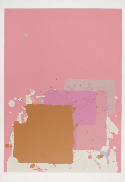
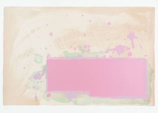
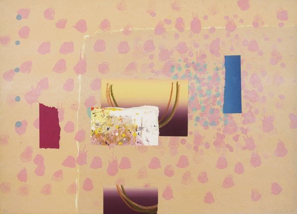
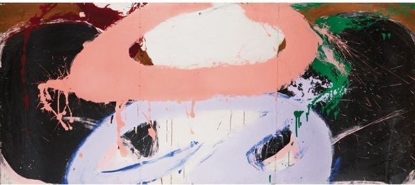
Curator: This is John Hoyland’s “Orange, Pink,” created in 1971 using acrylic paint. Editor: Well, it's certainly…pink. It evokes a certain kind of serene yet detached sensibility. I feel almost like I am looking at an architectural plan or blueprint that's been left to fade slightly in the sun. Curator: A perceptive reading. Note how the geometric forms are layered with varying opacities and intensities, inviting consideration of space. Observe how those stark horizontal shapes are countered by more amorphous splatters of similar pink. It produces an almost diagrammatic composition. Editor: Precisely, the shapes lend a weight to it. But it also brings forth something much more primal too, that connection with human flesh—the blush, flush, and all associated narratives, if you like, connected with skin and our emotional responses to color. Curator: An astute observation. Hoyland often eschewed direct representation, instead focusing on the emotive qualities of colour itself. The juxtaposition of hard-edged geometry and almost uncontrolled splatters opens a field for interpretations, a semiotic game of formal structures and liberated applications. Editor: The orange also does more work here than it may first seem. It grounds the eye and allows the pink shades around them to shimmer by comparison, an interesting device for balance! One could certainly spend a great deal more time reading such works from this master formalist and colorist. Curator: It serves as a reminder to examine not just the individual components, but also their interrelations within the aesthetic structure as a whole. Editor: Indeed. It is this conversation between intention, technique and perception which make abstract art so lasting and evocative.
Comments
No comments
Be the first to comment and join the conversation on the ultimate creative platform.
More like this