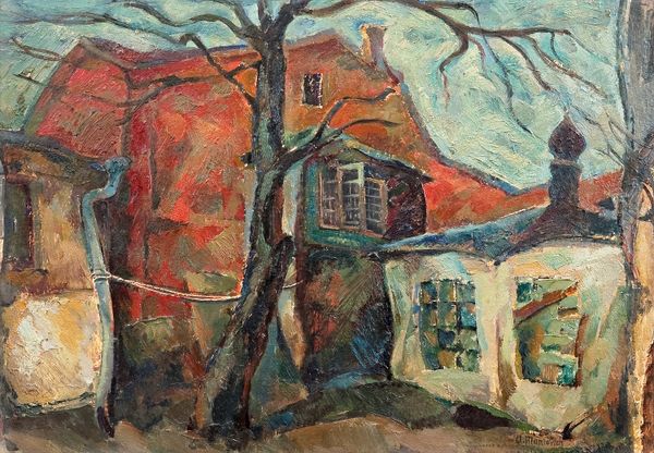
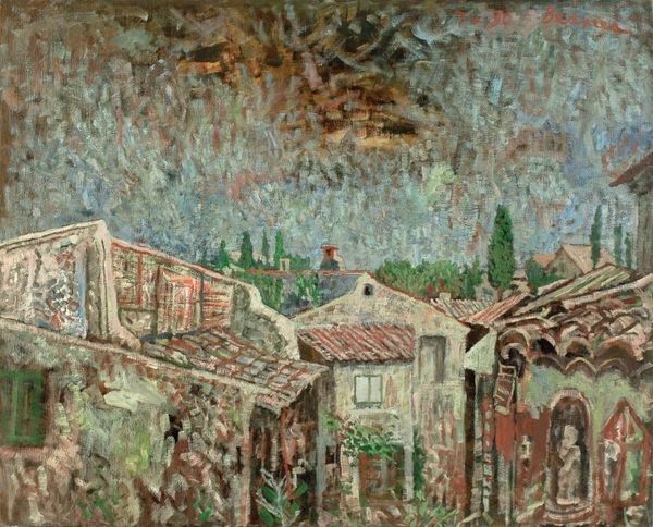
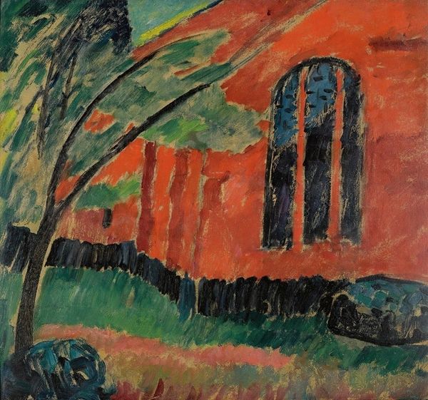
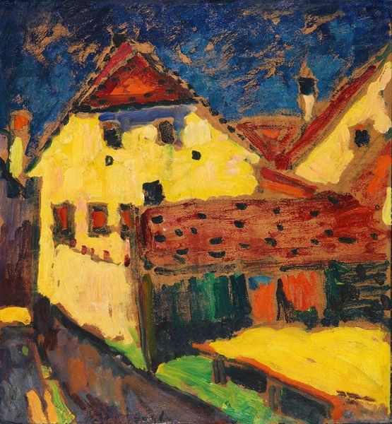
painting, oil-paint, impasto
tree
painting
oil-paint
landscape
oil painting
impasto
romanticism
Copyright: Vera Nedkova,Fair Use
Editor: Here we have "Landscape," an oil painting by Vera Nedkova. The impasto technique gives it such a tactile feel; you can almost feel the texture of the buildings and trees. There's something both serene and slightly unsettling about the scene. What do you see in this piece from an art expert's point of view? Curator: Disregarding any overt representational content for a moment, let's consider the formal properties. Note the juxtaposition of the cool white building against the fiery red trees, for instance. This chromatic opposition creates visual tension, no? Editor: Yes, it does. The colors are quite striking. Curator: Precisely. The artist's brushwork, quite visible throughout, generates a dynamic surface. And how do these formal choices contribute to a broader understanding? Does this interplay communicate the work's meaning, perhaps about humanity's tenuous hold in nature? Editor: I hadn't considered that, but it does make sense. The vivid red, especially, pulls the viewer's eyes. The architectural forms are much softer, more muted. It seems the painting uses this dynamic of natural vs constructed shapes. Curator: Precisely. And observe the buildings’ rigid geometry relative to the organic forms of the trees; what is being explored, structurally? Consider also the application of paint: it accentuates depth through its three-dimensional quality on a two-dimensional surface. Editor: Thank you. That structural reading has certainly shed new light on the interplay between color, texture, and form. Curator: My pleasure. I hope my reading clarified certain relationships inherent in the pictorial structure.
Comments
No comments
Be the first to comment and join the conversation on the ultimate creative platform.