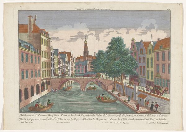
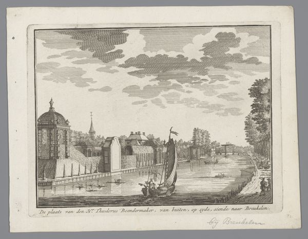
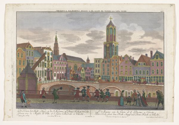
Gezicht op de Weesbrug over de Oudegracht en de Doopsgezinde Kerk te Utrecht 1742 - 1801
0:00
0:00
georgbalthasarprobst
Rijksmuseum
print, etching, watercolor
#
dutch-golden-age
# print
#
etching
#
landscape
#
watercolor
#
coloured pencil
#
cityscape
#
watercolour illustration
#
genre-painting
Dimensions: height 305 mm, width 430 mm
Copyright: Rijks Museum: Open Domain
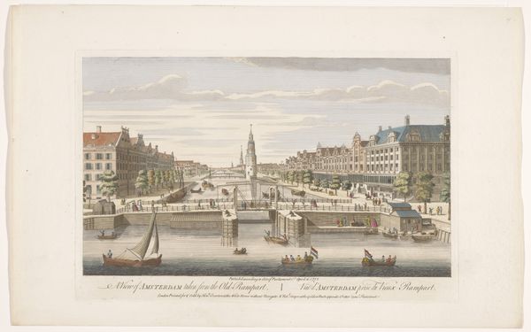
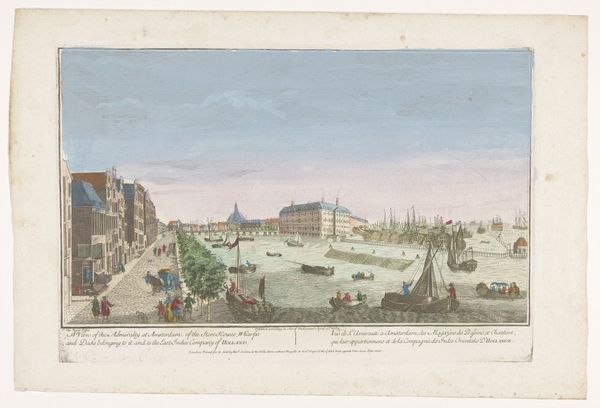
Curator: Ah, yes, this delicate rendering captures a slice of Utrecht life from the 18th century. It’s titled "View of the Wees Bridge over the Oudegracht and the Mennonite Church in Utrecht," attributed to Georg Balthasar Probst. It's a print combining etching and watercolor. Editor: Well, straight away, it has this kind of dollhouse charm, doesn't it? Everything seems perfectly placed and sweetly rendered, like a stage set, and this light-as-air coloring. Curator: Absolutely! It is interesting to see the buildings so precisely drawn, reflecting the engraver's hand, before then being delicately brought to life with washes of color. Probst has combined those approaches beautifully. Editor: Looking at it from the lens of production... These prints were made for consumption. This scene wouldn't only give you a view of the physical layout of Utrecht, but of social class. It would give the impression of what city life might offer in terms of aspiration. I am thinking of those sharp lines around the architectural elements contrasting with the gentler watercolors of the figures at the forefront, as if to draw a distinction of status. Curator: That's insightful. I am quite taken with the tiny figures. Are they conveying stories in their groupings along the canals? There's a playful energy and a bustling quality to these interactions, almost cinematic. Editor: Absolutely, there is labor and play shown within the frame. Consider the role of printmaking in that period. This would be for distribution en masse to a market that would find aesthetic value in a scene that speaks about place and production. So this is for pleasure, but the printing press is creating jobs and offering something potentially affordable. Curator: It is really interesting to consider that accessibility. Almost a form of early advertising. It hints at a shared humanity amid what you're describing as very much an engine of capitalism! So lovely how those ideas intersect here. I think what I’ll take away is how the hand of the artist meets the eye of the documentarian to reveal layers of a past that is more complicated and captivating than its initial presentation reveals. Editor: For me, it's the way that the delicate handwork is belied by what must have been something close to an industrial manufacturing approach in bringing those colors to life through many units made for commerce. Thanks for walking through that, it’s provided real clarity.
Comments
No comments
Be the first to comment and join the conversation on the ultimate creative platform.
More like this