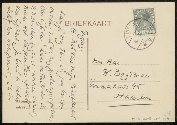
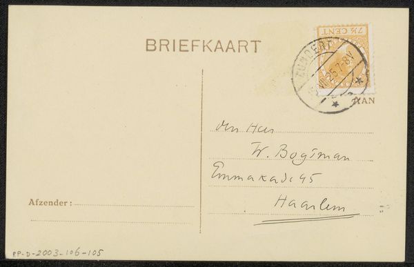
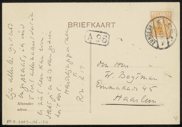
drawing, paper, ink
#
portrait
#
drawing
#
paper
#
ink
#
modernism
#
calligraphy
Copyright: Rijks Museum: Open Domain
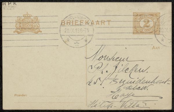
Editor: So, this is "Briefkaart aan Willem Bogtman" by Henriëtte Roland Holst-van der Schalk, likely from the 1940s. It's an ink drawing on paper – basically, the back of a postcard with a handwritten message. The script itself is really striking and kind of overwhelms the composition at first glance. What strikes you about this piece? Curator: The interplay between the graphic elements and textual information presents a compelling formal study. The hand-written calligraphic forms operate on two levels simultaneously; they are conveyors of information and function as abstract design. Notice how the looping ascenders and descenders create dynamic rhythms across the surface. Consider the formal relationship between these looping forms and the geometric shapes, such as the rectangular 'BRIEFKAART' title and the circular postage stamp. How do these elements contribute to the work's overall structure? Editor: I see what you mean about the rhythm! It almost makes the text feel like a pattern, even though it's a personal message. The rigid stamp creates a visual tension with the fluid writing, and the layout feels so unconventional. What about the different thicknesses of the lines, how does that inform the visual experience? Curator: Precisely. The variations in line weight generate depth and complexity. Observe the bold, decisive strokes juxtaposed with the delicate, almost ephemeral lines. This deliberate manipulation of line suggests an intention to create visual interest, disrupting any sense of flat uniformity and thereby enhancing its texture. It introduces an element of dynamic spatial recession within a mostly flat image plane. It beckons the viewer for decipherment on textual as well as abstract formal grounds. Editor: That's a perspective I hadn't fully considered. Seeing it as a study in line and form rather than just a note really shifts the focus. Thank you! Curator: It illustrates how even everyday items like postcards can possess profound artistic qualities through a close observation of visual elements and thoughtful arrangement of formal design principles.
Comments
No comments
Be the first to comment and join the conversation on the ultimate creative platform.
More like this