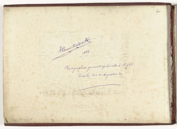
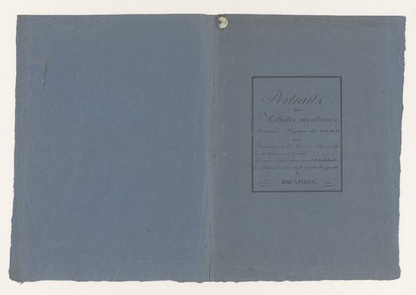
Excelsior : een Nederlandsch maandblad met originele foto's geïllustreerd 1916
0:00
0:00
drawing, print, paper, ink
#
drawing
#
script typography
#
paperlike
# print
#
sketch book
#
hand drawn type
#
personal journal design
#
paper
#
personal sketchbook
#
ink
#
hand-drawn typeface
#
journal
#
fading type
#
delicate typography
#
modernism
Dimensions: height 193 mm, width 145 mm, thickness 3 mm
Copyright: Rijks Museum: Open Domain
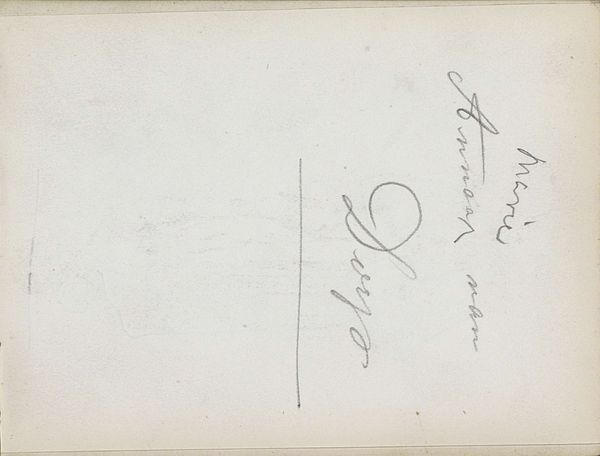
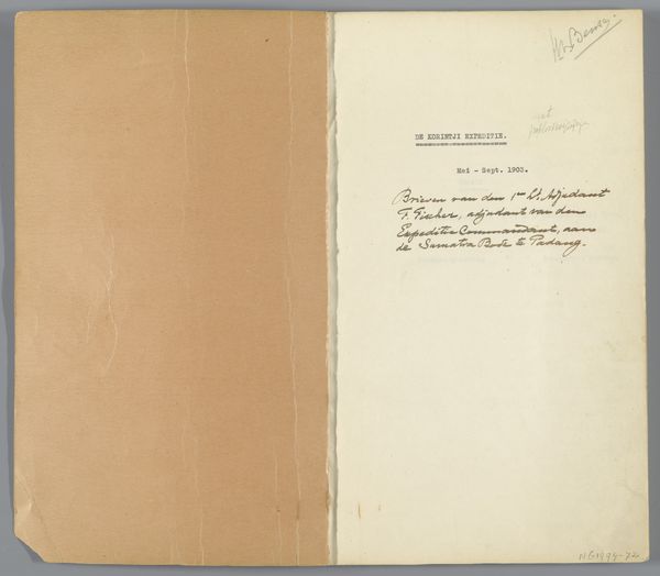
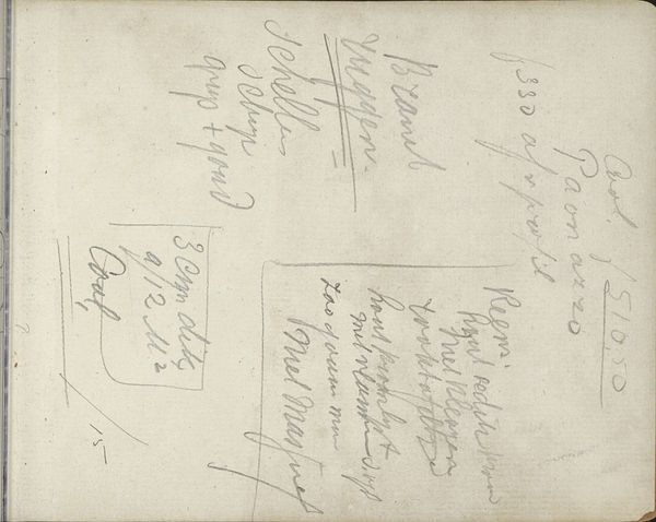
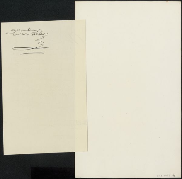
Curator: Here we have the cover and title page for "Excelsior: een Nederlandsch maandblad met originele foto's geillustreerd", a Dutch magazine from 1916, created by P. Martin and J. Dingemans. It’s a lithograph print on paper with ink drawings. Editor: My immediate impression is one of quietude and delicate refinement. The script appears almost whispered across the page. It’s a surprisingly intimate encounter. Curator: It's fascinating how the artists evoke a sense of modernism using such restrained means, isn't it? Note the meticulous details in the hand-drawn typography—how each letterform subtly distinguishes itself, giving it texture and a unique script quality. Editor: Yes, I'm particularly struck by how the handwritten aesthetic gestures toward a desire for personalization, even within a publication intended for mass readership. The faded appearance suggests an intimate peek into a personal journal. Consider how this positions itself within the broader context of wartime publications. What narratives did it amplify? How might its aesthetics either reinforce or challenge existing notions? Curator: It is hard to say without seeing what is inside the journal. Regardless of its broader place in culture and its history, one cannot overlook the structural interplay of elements. See how the linear progression, carefully rendered on slightly off-white paper, evokes a sensation of both timelessness and fragility? The meticulous nature in which they were composed and designed is really striking. Editor: The deliberate use of the ink's weight also subtly invites introspection upon these textures and the shapes they create—which would give each page more uniqueness and feeling. A direct counterpoint to industrial printing methods that sought to be ubiquitous at this period of war. I wonder about its immediate cultural impact. Curator: And yet, it is a print, and was meant for broad readership. So there is a synthesis occurring across the techniques in drawing, script, and material that give the work the most unique feel of hand drawn texture with mechanical design. Editor: I agree. By blending accessibility and a quiet message of artistic modernism, the work speaks volumes regarding social and cultural undercurrents that informed art at the beginning of the 20th century. Curator: Yes, examining how simple formal decisions contribute to creating that sense of intimacy has reshaped my understanding, indeed. Editor: For me, understanding it not just as aesthetic design, but also a commentary to artistic culture from its historical moment, and the visual culture that underpinned it, is invaluable.
Comments
No comments
Be the first to comment and join the conversation on the ultimate creative platform.
More like this