Copyright: http://www.stigbroegger.net/shooting
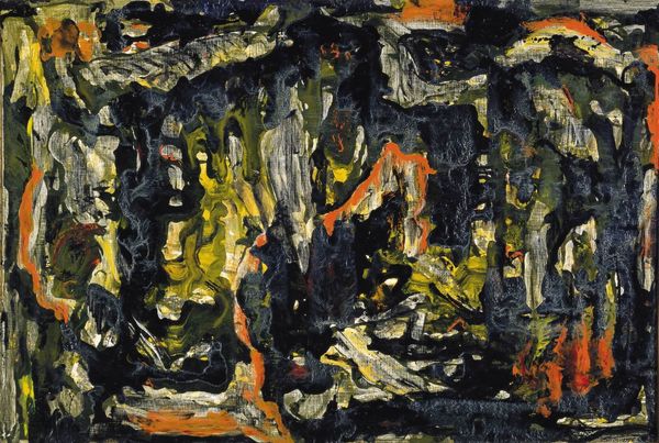
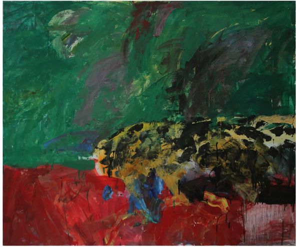
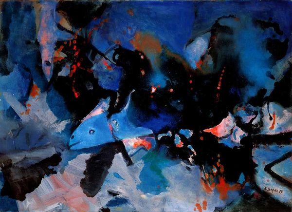
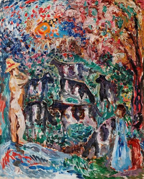
Stig Brøgger made Luerne using paint, and he wasn’t afraid to mix it up. It's like he dove headfirst into a process, letting the colors smear and blend, making a space where definition goes to die. Look at the surface – thick in places, thin in others. You can practically see the history of Brøgger’s movements in each stroke. The darks really pull you in, swallowing up the bright spots that pop like little explosions, daring you to make sense of the composition. My favorite part is where the white, orange and turquoise meet dead center; this gesture suggests some kind of face or mask, which is pure speculation but that’s the point, right? It reminds me a bit of de Kooning, actually, that same kind of push and pull, where what you see shifts with every glance. We’re not just looking at a picture; we’re in conversation with it.
Comments
No comments
Be the first to comment and join the conversation on the ultimate creative platform.
More like this