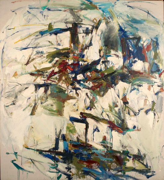
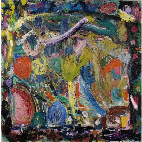
Dimensions: 105 x 126 cm
Copyright: Gary Wragg,Fair Use
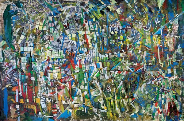
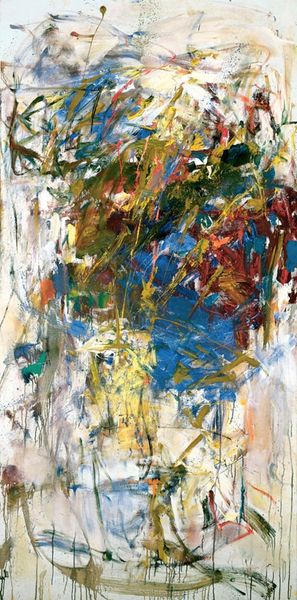
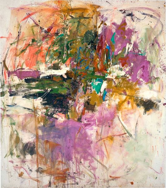
Editor: We're looking at "The Gap II" by Gary Wragg, created in 1990 with mixed media, including acrylic. I find the chaotic energy captivating, like a visual representation of pure emotion, yet the longer I look, I also sense compositional structures. What catches your eye? Curator: The most immediate aspect is the application of paint itself. Notice the vigorous brushstrokes, the layering, and the almost sculptural impasto in certain areas. Wragg is clearly interested in the materiality of paint. Where do you see relationships between form and color? Editor: Well, the blues and greens seem to coalesce and suggest volume, while the brighter pinks and yellows act as disruptive accents. Is it possible to reconcile these divergent chromatic groups to each other formally? Curator: Precisely. The canvas is densely populated, but it avoids total dissolution due to the chromatic arrangement and structural considerations. Look at how he creates a sense of depth not through traditional perspective but through overlapping planes and the relative intensity of hues. The gestural marks, even in their apparent randomness, construct a non-illusory but highly active field. Do you observe this energetic activity in the center or around the canvas’ borders? Editor: I see a dynamic interplay across the whole picture plane. It doesn't seem hierarchical; no one area dominates. It's like the entire surface is charged with equal energy. Curator: That equal distribution of energy, achieved through the artist’s deliberate mark-making, creates what we describe as “all-over composition” reminiscent of the later works by Jackson Pollock. These abstract expressionist traits become amplified with its active strokes. Do you agree that each singular stroke should be judged formally for the effects of creating this unified picture plane? Editor: Absolutely, seeing it like that helps me move beyond my initial impression to consider Wragg’s formal decisions and how he orchestrated the overall viewing experience. Curator: Indeed. Close scrutiny of form generates insight that would be impossible if we ignore the materiality. Now, looking at it for the last time, how might this appreciation for color and composition enhance the experience for future audiences? Editor: By emphasizing the interplay of structure and color, others can connect with the visual architecture underlying the abstraction, understanding it as more than just a burst of feeling. It becomes about carefully calibrated formal relationships.
Comments
No comments
Be the first to comment and join the conversation on the ultimate creative platform.