drawing, pencil
#
drawing
#
aged paper
#
toned paper
#
light pencil work
#
art-nouveau
#
pencil sketch
#
sketch book
#
personal sketchbook
#
ink drawing experimentation
#
geometric
#
pen-ink sketch
#
pencil
#
sketchbook drawing
#
sketchbook art
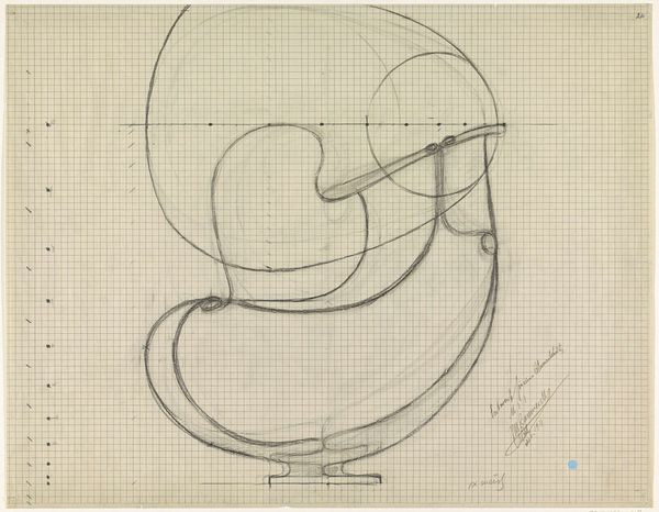
Dimensions: height 304 mm, width 364 mm
Copyright: Rijks Museum: Open Domain
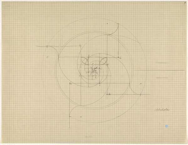
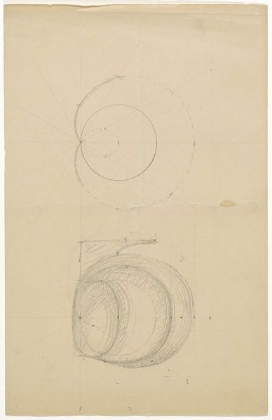
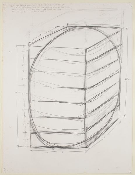
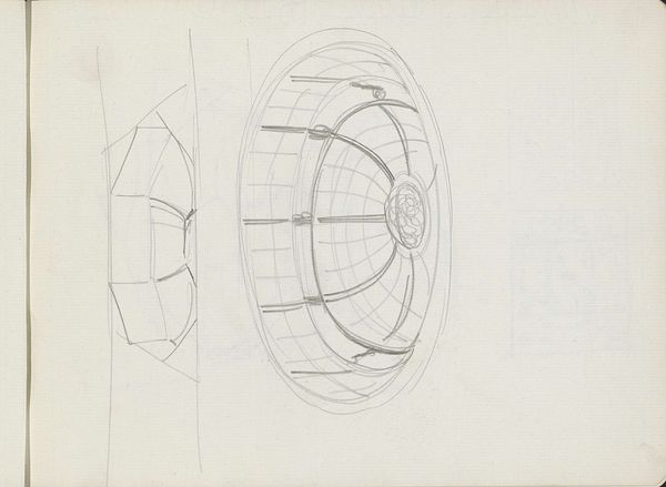
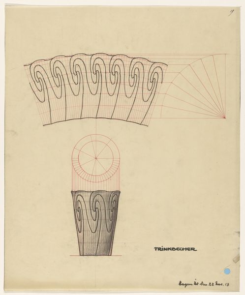
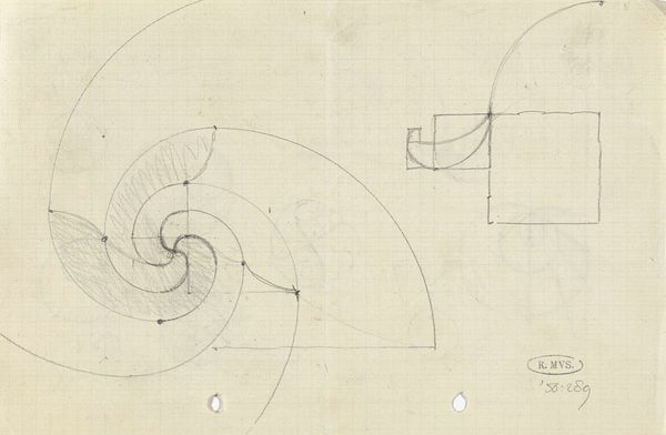
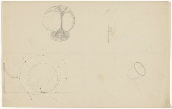
Editor: So, we're looking at "Ontwerp voor een zilveren theepot," or "Design for a Silver Teapot," possibly from 1913, by Mathieu Lauweriks. It's a pencil drawing on toned paper, and it's just... fascinating. It feels like an architectural plan more than a piece of decorative art. I'm struck by the almost mathematical quality overlaid on the simple, curving form. What do you see in this piece? Curator: What *don’t* I see? It’s like Lauweriks took a perfectly lovely teapot and then decided to dissect it with geometry. He’s practically shouting about the underlying structure. The circles, the precise lines... it’s like he’s saying, “Beauty isn’t just surface; it's inherent in the form, in the ratios.” Do you find that those lines add or detract from the aesthetic quality of the sketch? Editor: It’s definitely a lot to take in! I guess initially, I thought it looked a bit cold, a little sterile almost, but the more I look, the more I appreciate that precision. It reveals the intention, the *thought* behind the curves. It’s almost like he’s reverse-engineering beauty. Curator: Reverse-engineering, yes! That's a beautiful way to put it. It’s like he’s holding up the teapot and saying, "Look, folks, here’s the magic trick – only it’s not magic, it’s design." This blend of Art Nouveau's organic forms with almost mathematical rigidity… that’s Lauweriks, all right. He was deeply into geometric systems, theosophy, all these things aiming to find universal harmony. Do you see how this geometrical deconstruction actually elevates such a quotidian item as a teapot to something spiritually sublime? Editor: I think so. Initially, it just looked like some technical drawing with too many construction lines! Now I feel like I'm seeing this humble object with the same intention and purpose the artist brought to it. Curator: Exactly. It's less about the tea, and more about the ideal form, the underlying structure, of *teapot-ness* itself.
Comments
No comments
Be the first to comment and join the conversation on the ultimate creative platform.
More like this