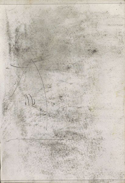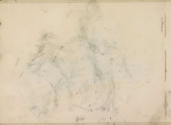
1875 - 1934
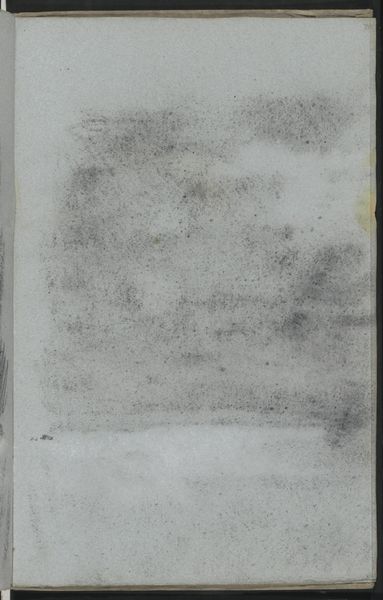
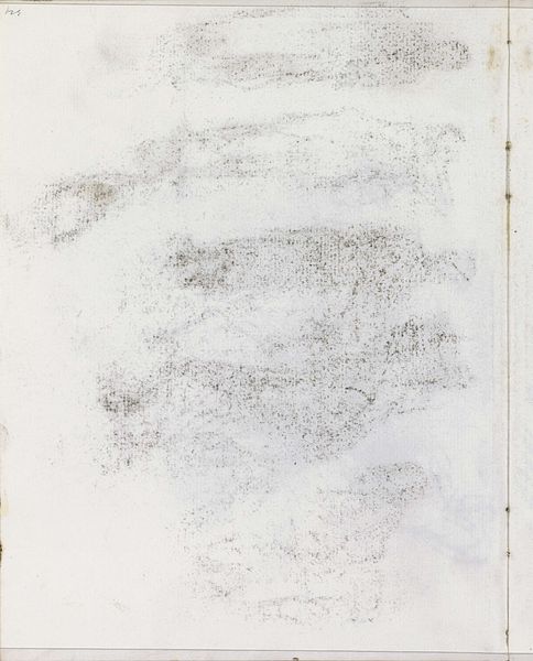
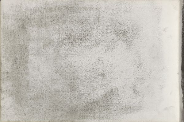
Abklatsch van de krijttekening op blad 40 verso
Isaac Israels
1865 - 1934Location
RijksmuseumListen to curator's interpretation
Curatorial notes
Editor: This wispy graphite and pencil work is titled "Abklatsch van de krijttekening op blad 40 verso," which roughly translates to "Print of the chalk drawing on sheet 40 verso". It was created by Isaac Israels sometime between 1875 and 1934 and currently resides in the Rijksmuseum. The first impression I get is of an incomplete image, maybe ghostly. What stands out to you when you look at this drawing? Curator: The material quality of the work interests me immediately. Observe the interplay between the graphite, the pencil, and the texture of the paper. How does the artist create form and depth with such limited tonal range? Editor: It seems very subtle. The shading is minimal. Are you suggesting the lack of color encourages the viewer to focus on those formal properties you mentioned? Curator: Precisely. Israels masterfully exploits the intrinsic qualities of the medium. Notice how the graphite isn't just used for lines, but also to create washes and subtle variations in texture. Do you see the faint blue line? What do you think about the visible pentimento here, showing changes in the artist's intention? Editor: Now that I'm looking for it, yes. I notice what seems to be a partial blue-grey wash within the main strokes of the central figure. Perhaps the artist was going for atmospheric depth? Curator: Interesting point! Consider how Israels’ use of negative space – the unworked areas of the paper – contributes to the overall composition. Does that absence suggest a deeper meaning to you, or does it simply reflect the artist's stylistic economy? Editor: I can see how the negative space actually gives form to the image. Thanks, that really sharpened my view! Curator: And considering the surface, and Israels' control of his mediums, has deepened mine.