#
capitalist-realism
Copyright: 2019 Gerhard Richter - All Rights Reserved
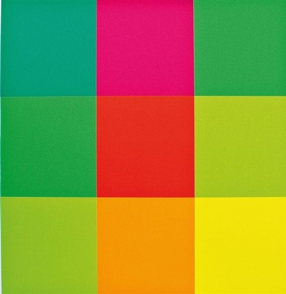
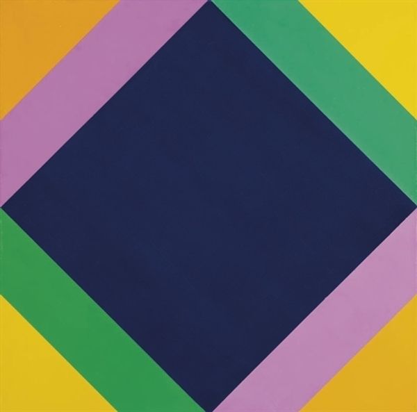
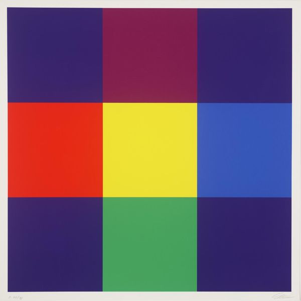
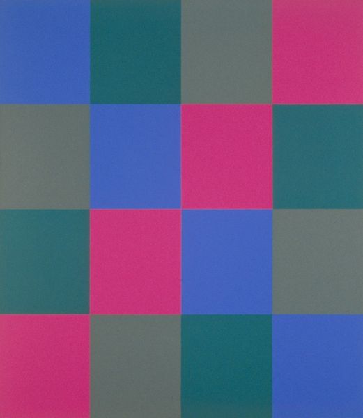
Curator: This is Gerhard Richter's "Quattro Colori," a piece he created in 2007 using acrylic paint. What strikes you first about this work? Editor: Honestly? It reminds me of building blocks, you know? Like something really elemental. Primary school vibes with those vivid colors, but there's something oddly satisfying in its simplicity. Curator: It is quite simple in its visual language. Richter, particularly in his later career, has consistently explored color and abstraction. This piece really epitomizes his ongoing investigation into color theory and the legacy of modernism. How does this seemingly simple arrangement engage with those traditions? Editor: Well, the obvious connection is Mondrian, but without the angst. It's bold and direct but also playful. It's like Richter’s winking from behind these blocks of pure hue, acknowledging art history without taking itself too seriously. Curator: Exactly. He often engages in a dialogue with art history, critiquing and building upon it simultaneously. There’s an institutional critique inherent to taking simple geometries and claiming their continued relevance in contemporary art. And how do you see the scale of this work influencing its impact? Editor: The size does matter, doesn't it? It avoids being dismissed as mere decoration. These aren't swatches; they're confident statements. If it were smaller, it might just feel like a design exercise. Here, the colors just command attention and make a statement. It gives a really good feeling! Curator: Indeed. It's interesting to consider how something so reductive can also be so captivating. What's your parting thought about “Quattro Colori”? Editor: That in art, sometimes the loudest statement is made with the fewest possible words…or colours, in this case! Curator: A concise and insightful observation, fitting for the piece.
Comments
No comments
Be the first to comment and join the conversation on the ultimate creative platform.
More like this