drawing, graphic-art, etching, ink
#
abstract-expressionism
#
drawing
#
graphic-art
#
etching
#
figuration
#
ink
#
linocut print
Copyright: Pierre Alechinsky,Fair Use
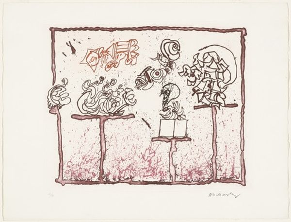
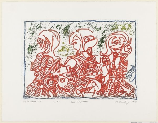
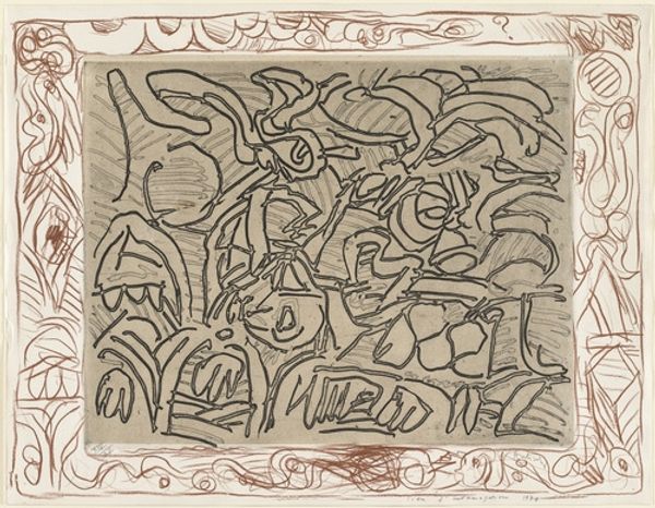
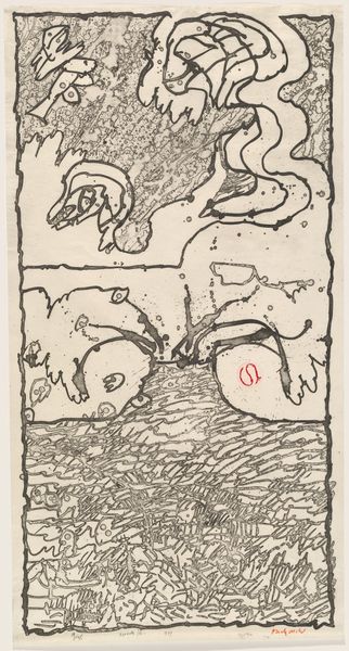
Curator: Looking at this 1966 ink drawing by Pierre Alechinsky titled "Untitled from The Test of the Title," my initial reaction is one of visual frenzy! So much going on—forms jostling for space, lines darting in every direction. What strikes you first, Editor? Editor: The overall impression is quite whimsical, yet unsettling. There’s a frenetic energy, certainly, but controlled. The artist employs what appears to be simple linework in shades of pink-red, but manages to create a remarkably complex composition. Curator: I agree! The limited palette directs our attention to the iconography at play here. Do you see how certain motifs repeat? The distorted figures, the boxy shapes with faces—it reminds me of a symbolic language waiting to be deciphered. Each figure seems like a character plucked from a dream. Editor: Absolutely, and that interplay between figuration and abstraction is crucial. While the forms aren't easily identifiable, there is clearly some intentional structure in the repetition and arrangement. Notice how the jagged border mimics the energetic strokes within? Curator: Good observation! It's as though the inner turmoil spills out onto the edges. Knowing Alechinsky’s connection to the Cobra movement, with its emphasis on spontaneity and childlike expression, adds another layer. The piece could be seen as a rejection of formal artistic conventions. Editor: True. And that "Test of the Title" bit—suggesting perhaps the absurdity of trying to encapsulate such free-flowing thought within rigid linguistic frameworks. It acknowledges the limitations inherent in meaning-making, doesn’t it? Curator: Exactly. Perhaps it implies how titles may also constrain our reception, predetermining the work's impact before we even experience it. The title ironically sets up a false premise: that this drawing, this eruption of graphic gesture, even requires further explanation! Editor: Precisely! It's an open-ended conversation rather than a definitive statement, challenging our own preconceptions about what art should communicate, how it should behave. Curator: Studying the image now, it feels less like a random expression and more like a carefully constructed map of the subconscious, revealing fragmented selves and primal energies. It’s less a decorative drawing than an urgent artifact! Editor: Yes, now it really highlights the potent relationship between spontaneous mark-making and intentional structure that make the viewing experience both captivating and deeply unsettling. Thanks for directing my focus there.
Comments
No comments
Be the first to comment and join the conversation on the ultimate creative platform.
More like this