graphic-art, print, linocut
#
graphic-art
#
art-nouveau
# print
#
linocut
#
landscape
#
figuration
#
linocut print
#
symbolism
#
cityscape
Copyright: Public domain
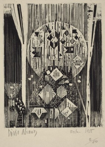
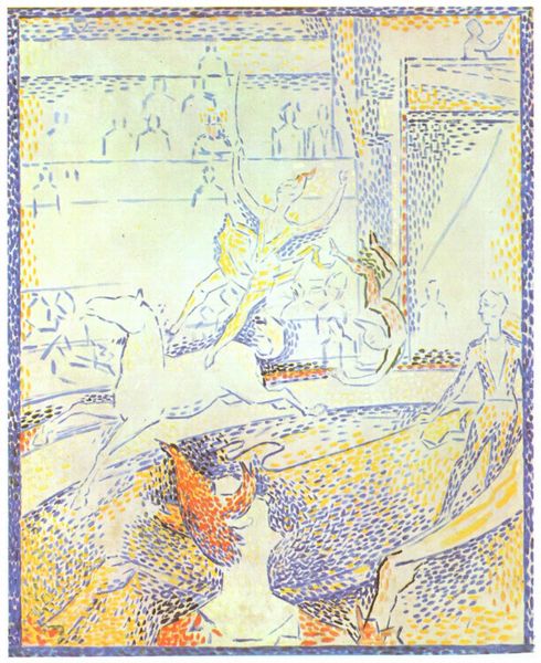
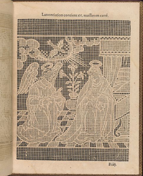
Curator: This is the front page of ‘Apollo’ magazine, designed by Heorhiy Narbut in 1916, a linocut print embodying the artistic currents of its time. What strikes you initially? Editor: It's stark, almost austere. The contrast between the ochre chariot scene and the detailed brickwork creates a dramatic effect. The city feels both monumental and in ruins, doesn't it? Curator: Absolutely. The piece resonates with a Symbolist aesthetic. Narbut subtly uses the chariot and ruined cityscape as potent symbols reflective of the era's sociopolitical turbulence. The ruins themselves speak volumes about societal decay. The very date – 1916 – is etched within this scene. World War I was raging at this time. How do you interpret the materiality in light of the context? Editor: The choice of linocut, a technique allowing for crisp, bold lines and reproducible images, suggests a democratisation of art. The material itself speaks to making art accessible amid crisis. The texture – that contrast between the smooth chariot scene and the rough stone textures – emphasises labour; perhaps alluding to both construction and destruction during wartime? Curator: Intriguing. Considering Narbut’s Ukrainian identity, within the context of Tsarist Russia during wartime, adds further layers. This isn't just about a generic cityscape but could symbolize lost homelands, threatened cultural identities under imperial domination. The chariot – often interpreted as Apollo's – might allude to enlightenment, artistic expression combating darkness. Editor: So, even this magazine cover embodies a struggle for cultural survival. Narbut, in choosing linocut, makes the work reproducible. It brings high art techniques into the world, to the everyday. I'm considering it a work meant for wider consumption. What lasting impression do you feel this artwork leaves? Curator: It reveals how artistic practice, deeply entrenched in sociopolitical contexts, communicates powerful narratives beyond mere aesthetics. It demonstrates how a magazine cover serves as resistance. Editor: And for me, seeing it as a product of both intention and accessible materials makes me question why certain means of making art get valued more than others.
Comments
No comments
Be the first to comment and join the conversation on the ultimate creative platform.
More like this