Dimensions: height 90 mm, width 122 mm
Copyright: Rijks Museum: Open Domain
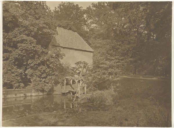
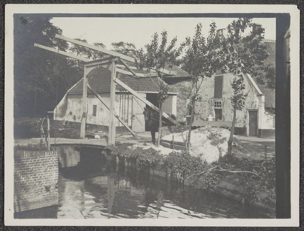
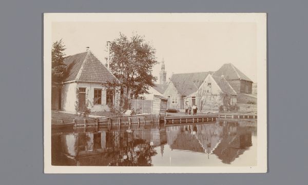
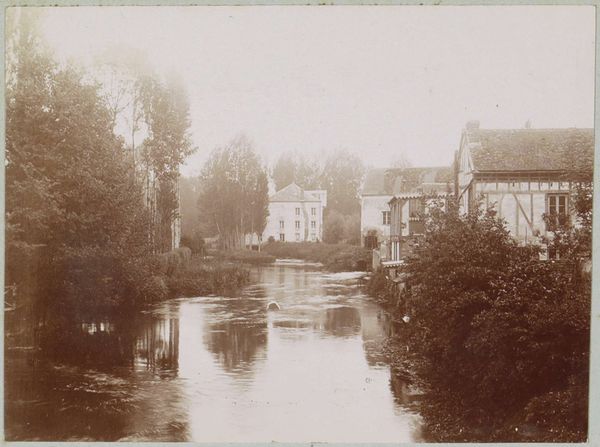
Editor: We’re looking at "Bij Voorburg," a photograph taken around 1915 by H.C. Wilkens. It's a sepia-toned landscape showing a building next to a body of water, with ducks. There’s something quite tranquil about it, maybe because of the soft tones. What do you notice first when you look at this photograph? Curator: Immediately, the interplay of light and shadow dictates the compositional structure. Observe how the diagonal of the building's roof creates a dynamic tension with the horizontal stillness of the water. The monochromatic palette serves not to flatten the image, but to heighten the textures: the rough surface of the building juxtaposed against the smooth reflection in the water. Editor: So, you are focusing on the balance within the image and how the materials are expressed? I can see that, the textures are quite different next to each other, as you said. What about the positioning of elements within the frame; how does that contribute? Curator: Precisely. The placement of the building off-center, nearly bisecting the picture plane, is crucial. It denies the viewer a simple, picturesque reading, introducing a slight unease. Further, the tonal gradations carefully structure spatial relationships and affect visual hierarchies. What is the role of the ducks within this arrangement? Editor: They do add to the calmness, almost like visual punctuation? Like small dots, they repeat across the image, reflecting into the water. Thank you. I did not quite look at them this way, before! Curator: Indeed, a detailed study reveals how meaning unfolds through its formal devices and invites reflection on their complex interactions. I'm pleased our analysis aided this process of looking.
Comments
No comments
Be the first to comment and join the conversation on the ultimate creative platform.
More like this