Copyright: CC0 1.0
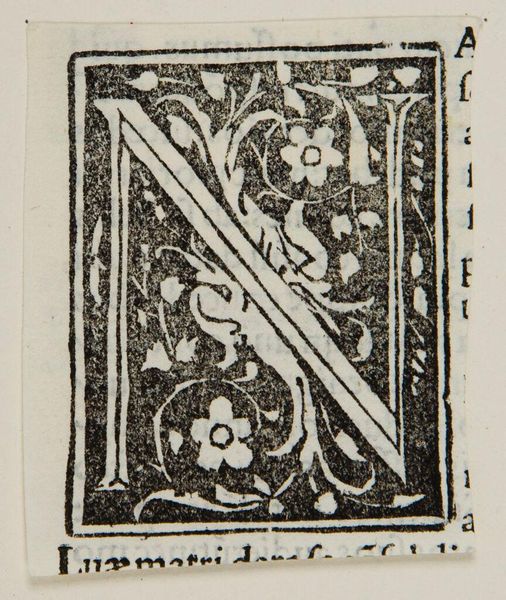
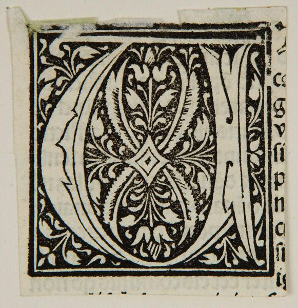
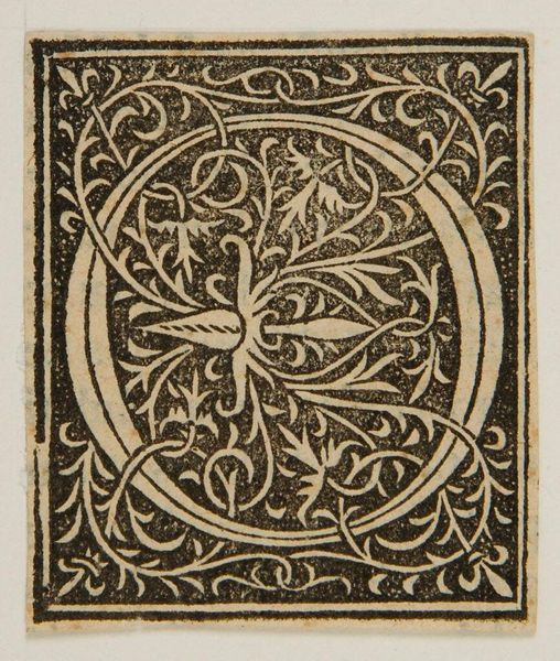
Curator: Here we have Initial N, a work by an anonymous artist, housed here at the Harvard Art Museums. Editor: The stark contrast immediately grabs the eye, doesn't it? So graphic, and contained. Curator: Indeed. The floral motifs intertwined with the letterform create a dense, almost claustrophobic composition. Note the texture. Editor: How would this fit into the broader culture? Initials like this were often used to mark significant passages within texts. Curator: Precisely. Consider the labor, the dedication required for even this small block. It elevated the written word. Editor: It's a reminder that even the smallest details can carry great historical weight. The piece makes you think of illuminated manuscripts and the power of the written word. Curator: Yes, and from my perspective, the interplay of negative and positive space generates a unique optical effect. Editor: A fascinating intersection of form and function.
Comments
No comments
Be the first to comment and join the conversation on the ultimate creative platform.
More like this