Copyright: CC0 1.0
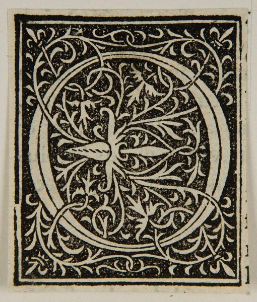
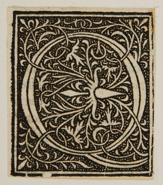
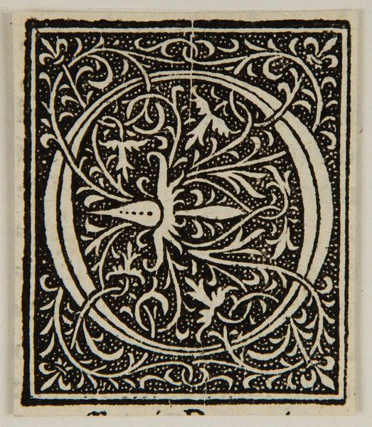
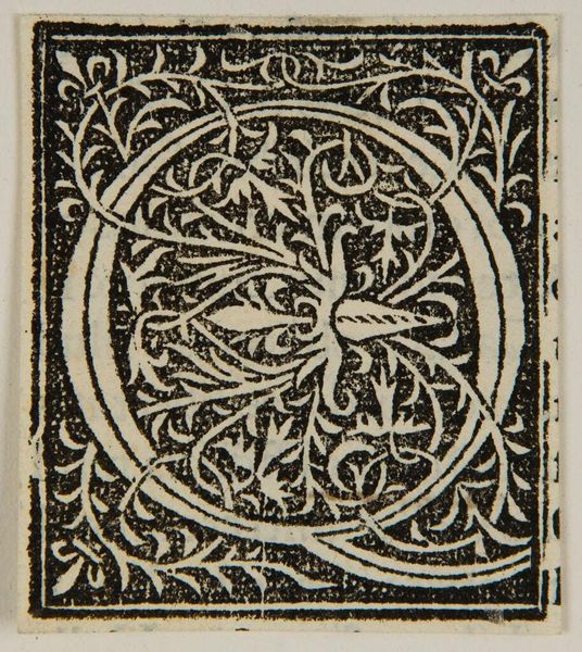
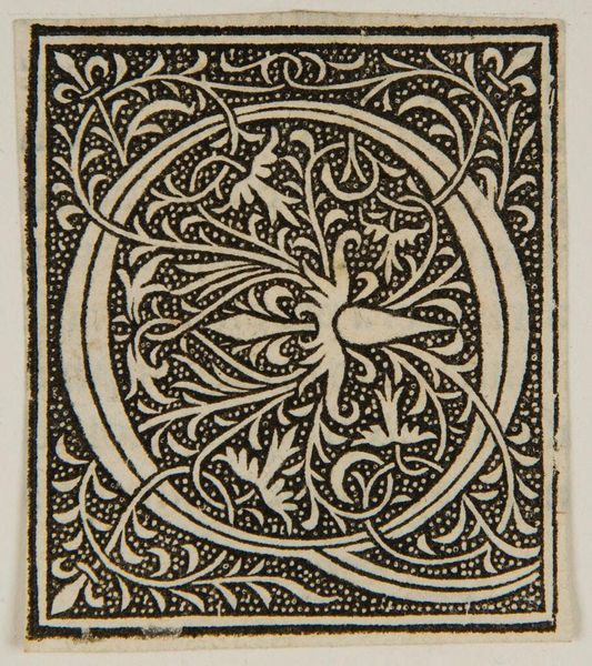
Editor: Here we have "Initial O," an anonymous piece. I’m immediately drawn to the intricate, almost symmetrical botanical design within the letterform. What do you see when you look at the composition of this initial? Curator: Observe how the density of the black ink contrasts with the negative space, creating a rhythmic pattern. The enclosed 'O' is not merely a void but actively shapes the visual narrative. Note the balance between the organic, flowing vines and the rigid geometric frame. Editor: It’s interesting how the vines disrupt the pure geometry of the letter. Is that a deliberate choice, do you think? Curator: Precisely. The tension between order and chaos, line and shape creates visual interest. The anonymous artist invites us to consider the formal elements. I wonder about its original context and function. Editor: That's so interesting. Thank you for sharing your insights. Curator: My pleasure. It's always rewarding to consider the interplay of form and function.
Comments
No comments
Be the first to comment and join the conversation on the ultimate creative platform.
More like this